Colorful thoughts
I'm back from the cardiologist safe, sound, and radioactive. I'm not sure how long I'm going to be emitting gamma rays, but I was warned not to go near any airports without a note of explanation from my doctor. Apparently I will set off all sorts of alarms for the next 24 hours! Come to think of it, I'm glad I decided not to stop at the mall on the way home. I'm sure the store security systems would have loved me. The test seemed to go well. The treadmill part was comparable to previous tests (10 minutes, no instability, good recovery). I won't know the results of the nuclear imaging until next week, but the doctor seems confident that it will show good muscle and good vascular flow. What that adds up to is very little quantitative evidence that now is the time for surgery; just qualitative evidence. His last word were, "We'll talk next week." And so we will.
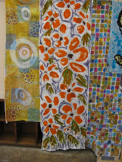
OK. As promised...pictures of recent work. I think I've mentioned that I'm working on cloth for two shows: "Quake" and "My Island". The island thing is really tripping me up. My responses have been very literal--I mean like drawing islands. I can meditate my way through all of the meanings of island: isolation, paradise, connection to other islands, even the shaky economy of many islands. I still end up with literal things coming out. Last week I gave in and printed a "pretty" sort of island-inspired piece of rayon and I really like it. It makes me think of trips to the Caribbean. Simple-minded, but nice. Its the piece in the middle with the orange flowers. Click the image to see more detail.
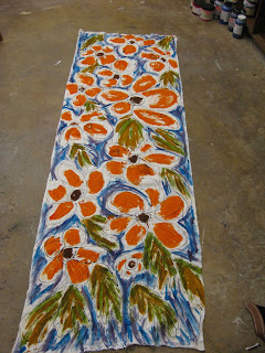
I liked the way that it looked. The basic sketch was done with black dye in a dental syringe. I could draw this way for hours. (I really need to do a monochromatic piece with just gesture drawing). The orange petals, brown centers, and leaves are all done as polychromatic screen prints. I do my polychromatic printing wet, not dried and deconstructed--paint it and pull it. In this case I was using a small scraper and pulling small areas at various angles. Anyway, it all seemed to come together with a nice sort of Matisse feel except for the violet color in the background. It was dead. Ergo, the title of this post, "Colorful thoughts".
The next time I went into the studio I painted a brighter blue into the background and it all came together. I think it's sort of a split complement thing. The violet was not a true complement to the orange. Adding the blue pushed the background and foreground a little further apart on the color wheel. What you see below on the floor had not been washed out yet. The color stood up very well and washing opened up the resist lines that are in the flower petals for a little more detail. I promise a "proper" photo of the finished piece soon.
OK. That has to be all for now. I've got scarves to sew.


