
Thoughts & news
Elements of Design: Day 5
This is getting harder, but I guess that's good. Perhaps it's also true that I'm getting tired. Today's exercises focused on the interaction of shapes with each other and with the negative space. The assignment was to make a series of 7x7" compositions using just 3 shapes in each, being mindful of interaction with the perimeter of the design space, varying shape scale, carving out lively negative space...the list went on.
So, here are some of the results, none of which met with particular critical acclaim. I'm trying to be mindful that there's often more to be learned from negative feedback than from praise. But, there's also a little, but rather insistent, voice in my head saying that it's very good to please the teacher. This is not the most helpful of my many internal voice.
The image below shows my first angular composition, which I tossed on the reject pile, only to be told later that it was better than my second attempt.

Here's that second attempt. I believe the feedback was along the lines of, "tight, static, vacant, and predictable." Ouch, but not inaccurate.

"Leaden," was the word for the following image. I'm struggling a bit with proportion. I love the quality of the curves, but I understand the comment. At least he didn't say, "phallic," which was not my intent.

I'll spare you the rest. Let's just say that I've got room to grow, and that's what next week is for.
For now, Dan is here. He arrived last night, and we're going to spend the next two days playing, eating, shopping, and relaxing in and around Columbus, including a trip to Athens tomorrow to see the Quilt National show. It's nice to be physically present in the same place at the same time. Between his travel and mine we've seen each other about 36 hours in the last 3 weeks.
Elements of Design: Day 4
As promised, today we began our discussion of shape, but not before a morning spent almost entirely with that same blasted 1X1" stamp. There's something to be said for deeply embracing the tool at hand--or in this case the one provided--but I'm really done at this point.
I started out revising my last piece from yesterday after consulting with David. I think it's greatly improved. More importantly, I understand why it's better.

Our final "official" challenge with the stamp was to create a design that referenced a surrounding border, again emphasizing size and tonal/depth relationships. I'm fairly pleased with the result. An early version was deemed "unfinished" during a late morning critique. I feel it's adequately resolved now, but that's just my opinion (which does count for something).

By afternoon we were discussing shape and creating cut paper inventories of different categories of shapes (angular, biomorphic, and synthetic). These concepts will be the starting point for tomorrow's compositions.

We've also started painting colored paper for next week's color compositions. There's a sort of zen quality to this preparatory work: mix the color, paint the paper, repeat. Think "wax on; wax off." It was a nice end to a kind of frenetic day that included a lot of what I'll call "adult learning moments" in which we asked lots of questions and didn't always understand the answers. Let's just say that adults who are paying to learn have a strong commitment to getting what they came for.

Elements of Design: Day 3
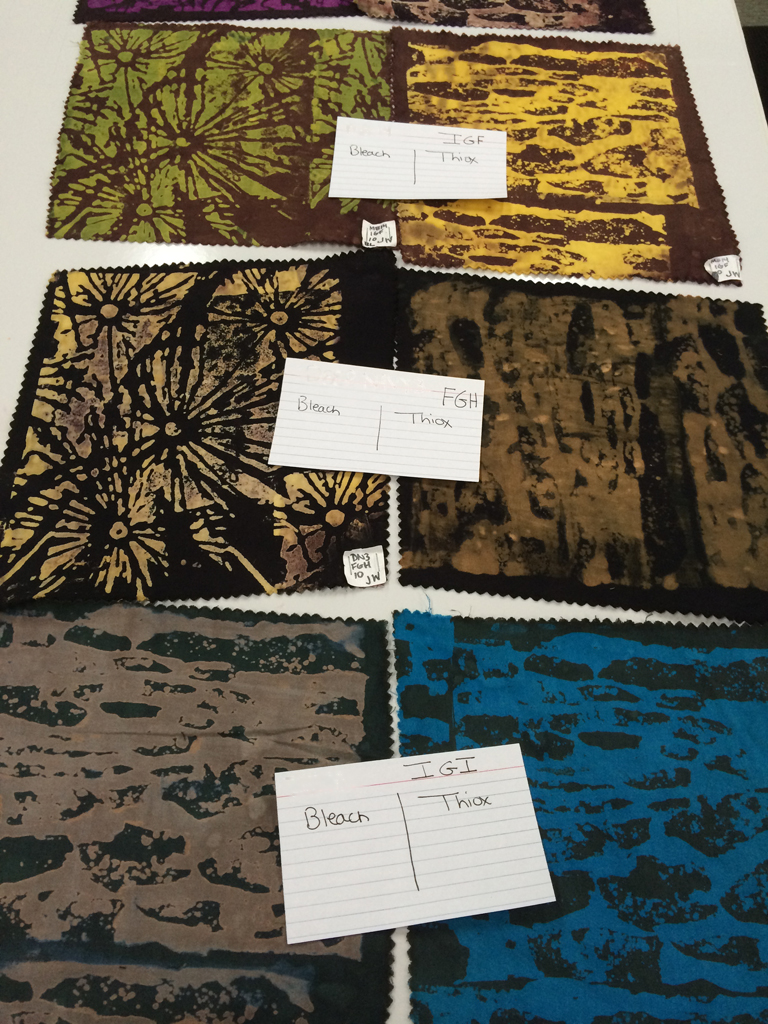
Today's topic was pattern. You would think that repeating patterns would be a walk in the park for a group where most everyone works in some sort of quilted textile form. Not so. Most of us made a few traditionally pieced quilts then followed our natural inclination away from that sort of structure and pattern. There was a good bit of grumbling today. But, this is supposed to be about learning to solve design problems.
All day we worked with a single blank 1x1" stamp. The first exercise was to develop a series of 4x4 patterns, pick the "best," and use that to build a 3x3 regular repeating pattern, including some combination of overlap, light, dark, and mid-tone values, and masking.
I'd rate my result as so-so.

The next assignment was to build an irregular pattern. I think that my result is only only subtly irregular. And, I can say that by now I was starting to not like being constrained by this particular 1x1" tool.

To the relief of all, our final assignment was to continue working with the same 6x6 grid of 1"squares and begin layering, using the grid as a foundation with which to interact. My two efforts thus far appear below. The second is definitely the more successful of the two. I think there will be time for one more run at it tomorrow morning before we move on to the next topic: Shape.
Elements of Design: Day 2
Today we continued our exploration of line, with emphasis on using line to build structure.
This is what I was thinking yesterday. They look like root forms, and I'm completely in love with the quality of the fine lines.
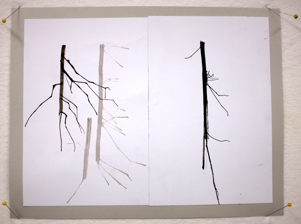
This morning, switching from ink to charcoal and pencil, we produced another round of line studies. The study below shows the same branching structure that I've been fiddling with in a combination of ink, pencil, and charcoal. The same branching structure is there, but it's simplified.

By afternoon we were working on creating thumbnail ink sketches of structures built from lines. A couple pages of these resulted in the idea at bottom right. The branching structure has simplified into sort of a budded stem.

Then we explored variations on an individual design with more thumbnails in black, white, and a mid-tone gray. Clearly some of these are better than others!

And finally, we did a larger scale rendering (6x6") of one design...

...which we then produced as a cut paper collage. I have to say that I'm pleased with both the process and the result. It's really nice when it turns out that way in a workshop, and a fine way to end the day.

At the Barn for "Elements of Design & Composition" with David Hornung
I'm in Ohio (about 45 minutes east of Columbus) for the next 2 weeks at the Crow Timber Frame Barn studying with David Hornung. Not having been an art major in school, I've never had a formal 2D design class. This is a chance to spend some quality time with a great teacher and a group of tremendously talented students focused on learning and relearning those fundamental principles of line, shape, etc.
Day 1 was all about line quality and tools (stick, brushes, straws, and more). Here are two line studies. I'm hoping to bring home a nice little portfolio and a lot of learning.


Lessons from my 365: A simple graphic palette promotes clarity
I love rediscovering things that I've always known, but sort of lost in my cluttered brain. Simplicity is on of those things I keep rediscovering, and every time I do, it brings me up short. Consider the designs below. Each is limited to a palette to 2-3 colors. The colors are also even or level, meaning that they aren't mottled or blotchy with visible brushstrokes. The result is that in each case there's a fairly clear relationship between figure and ground, and there's a clarity and crispness to the design.
Limiting the palette to a few discrete colors and rendering those colors evenly is key to this success.
What if you were to create a design that featured, let's say, 100 values of red, from pale pink to deep burgundy? Yes, they would be discrete colors, and they would also be from a limited hue range. It's certainly possible to use all 100 of those colors in a single design. It could be lovely. Such a palette could also allow you to create wonderful depth and transparency, but probably not the crispness of a limited palette.
You can see the same principle at work in a B&W photograph, which essentially a design using grey values from white to black. A low contrast image might appear flat or subdued, which the same image rendered at a higher contrast will appear more lively. One is not better than the other. It all depends on the artist's intent.


Lessons from my 365: Complementary colors add definition
Let's start with a few fun facts about complementary colors:
- Two colors are said to be complements of one another if they are located opposite each other on the color wheel. For example, red and green are complementary colors.
- The complement of a primary color (red, blue, yellow) is alway a secondary color (green, orange, purple) made up of the other two primaries. For example, yellow and purple (red + blue) are complements.
- Mixing two complementary color theoretically produces a color between grey and black. In practice, it's more likely to produce a chromatic grey that will probably have some bias toward a primary or secondary.
- Of course, all of this only applies when you're dealing with what's called a subtractive color model--like mixing paint or dye. The way that your computer monitor works--additive color--is a different thing.
Knowing all that, consider the designs below. The first thing I see is contrast. And, in fact, there are no two colors more different from one another than a complementary pair. So, contrast is a powerful tool in design because it leads to definition of shapes and lines.
Another thing you can expect to find in a design that features both transparency and complementary colors is a strong values created where complements overlap and combine. These value shifts can be used to add vitality, movement, and depth to a design.


Lessons from my 365: Transparency is a powerful tool. I just wish it was easier with dye.
The transparent affects that you see in the images below are just wonderful to my eye. In most cases, the transparency that you're seeing is similar to the effect you'd get from painting with an acrylic paint mixed with transparent medium.
Disclaimer: These images were created on a computer, and there's a bit more going on here than simple transparency. But I'm still using them to illustrate the difference between layering paint versus layering dye.
Painting a light color over a dark color produces a combination of the two colors because the base color shows through the transparent second layer. Applying multiple layers of transparent paint (seen clearly in the 3rd image below) increases the opacity of the transparent color. For example, applying multiple layers of transparent white paint over a dark background makes the white areas whiter with each successive layer.
Unfortunately (or fortunately, depending on your perspective), layering dye doesn't work the way layering paint does. All dye is transparent, and thus each layer is added to the previous layer. In this way, dye on cloth is most akin to watercolor paint on paper. You can never overlay one dye on top of another and get a lighter result. Building complex layering of color on dyed cloth requires thoughtfully planning the concentration of the dye solution and the order of layering, understanding the way that dye binds to fiber, and knowing how dye can be manipulated through resist and discharge techniques.
Some of the wonderful effects in these designs would not be achievable using the same layering I used to draw them on my iPad. Some would be just about impossible to achieve. Enter now the brave new world of digitally printed cloth, which opens all of these possibilities and then some. I could send any of these designs to a printer and have them rendered on cloth using a wide carriage inkjet printer
Having said all that--paint, versus dye, versus digital printing--while there are merits to being able to design complex transparency on a computer and print it directly on cloth, there's also a satisfaction that comes from intentionally or serendipitously creating complex layering through hand dyed processes.
It raises big questions through. Is the artist's hand less present in length of cloth printed on a computer-driven printer versus printed by hand? I say no...and yes...and no. And, I continue to wrestle with this question as I produce both hand dyed cloth and computer printed cloth.

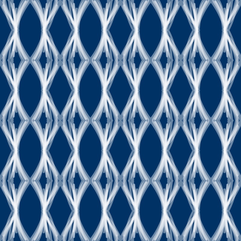


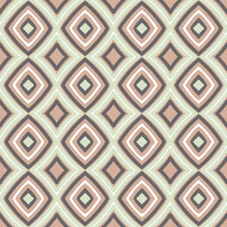
Lessons from my 365: 3 values of the same hue
A monochromatic color scheme includes only one hue, but there's nothing that says that every element in the design needs to be the same value of that hue. In fact, very successful designs can be created by manipulating the value of a single hue. Moreover, 3 values seems to be a sort of magic number. Consider the following designs. In each case, just 3 values of a single hue have been used, and yet, the designs are fresh, clean, deep, and uncluttered. These designs are among my favorites from the set of 365.


Lessons from my 365: Sometimes less is more
As with dessert, so too in design, it's very often true that less is more. Cleaner lines, fewer colors, and broader strokes are often easier on the eye (at least my eye) and more engaging. But when do you know that you've arrived at "enough" and not tripped over the line into the land of "too much"? Trial and error, time, practice, and honesty with yourself.
There's a wonderful yiddish word, ungapathka, which means overdone, excessively decorated. Think "cat sweatshirt attached with a bedazzler." While I claim no legitimate cultural connection to the language, I do love this word, and I think it captures the essence of "too much."
Consider the two designs below. The one on the left uses just two colors, and there's a balance between lighter and broader line weights and a mixture of lines and shapes. By contrast the design on the right--well, it lacks contrast. The designer (me) just kept adding more and more detail trying to breathe life into a muddied background with too little attention paid to the scale of the marks. Yes, there's a symmetry and an inner structure, but you've got to work too hard to perceive it, and meanwhile your eyes dance all over the place.


Lessons from my 365: Not every design is a winner
Well, doesn't this seem like a good place to start as I consider what lessons I might learn or re-learn from my recently completed "365 Patterns" project? Just because I put pen to paper, brush to canvas, or press the shutter release button on a camera doesn't mean the result is going to be a great work. Consider the following two images. I probably spent about the same amount of time on each, but the one on the left clearly has color issues and just isn't anything too special. The on the right is better: more depth, better positive/negative space relationships, and just generally more engaging.


So, what's to be learned from this confession? I think it's these thoughts:
- Do prepare to work by taking a few minutes to clear your mind and settle your body. This is my single biggest challenge.
- Do practice, and in doing so, sometimes work rapidly.
- Do balance rapid work with slower and more contemplative work.
- Don't become overly invested in the result before the process has even begun. "I will now create a successful work of art?" is a burdensome point of beginning at best, and more often than not the first step on the road to disaster.
- Don't loose sight of the fact that at some point there's greater value in working--regardless of the outcome--than in merely contemplating the work. Spend time with your thoughts, then get out of your head and do something.
- Do value the learning that comes from making mistakes and doing work that turns out to be less than expected.
My 365 project is nearing completion
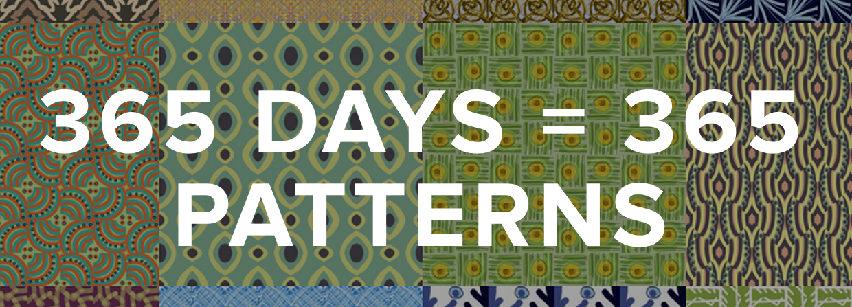
It's hard to believe that my 365 Patterns project is almost complete--an entire year of this. Actually, if I'm being totally honest it's already. All of the posts from now through April 15 are queued up to automatically publish at Noon each day. That's sort of the way the year has gone. Sometimes I've truly done one per day, and other times I've finished them in batches. I've learned quite a few things along the way, and I'm hoping to spend a bit of time reflecting on and sharing those lessons over the next few weeks.
Fantastic 2014 Festival of Lights

Dan and I spent the last two days doing the Greenbelt Festival of Lights Craft Show, which was a huge success. It was great to connect with so many new and returning customers and enthusiastic supporters. Thanks to everyone who made the event a highlight of the year, especially my awesome booth neighbors and the outstanding staff at the Greenbelt Community Center.
Yet another website redesign
I've lost count. I think I'm on my 5th web platform. I don't know if it's an insatiable curiosity about technology, a quest for better design, or just plain stupidity. Maybe it's a bit of all three. Whatever the case, welcome to the new site, which is still functional but still a bit under construction. Watch over the next few weeks and see how things take shape.
In case you're wondering, this latest iteration is built on Squarespace.com. The design aesthetic is a pretty big selling point. But I can also say that having built and run a Wordpress site for 2 years (including substantial coding), I'm ready to go back to something a little simpler. I'm a big fan of Wordpress, but there's just too many ways to get into trouble with it.
Greenbelt Festival of Lights just 2 weeks away

Visit my booth at the Greenbelt Festival of Lights Art & Craft Fair Dec 6-7th where I'll be selling original art cloth scarves. This is always a wonderful event and a great opportunity to shop locally, support makers and small businesses, and save money by purchasing directly from the source. It's hard to believe that this will be my 4th year participating.
Progress: drying out + rebuilding
We're making amazing progress on recovering from the flood. Damage to my Bernina 1090 was worse than I thought, but less than it could have been. Two motors and a full overhaul later, I've been told by the repair guy that it's performing very well. I'm hoping to see that for myself this weekend. The insurance company has been great about getting us through the cleanup and inspection process and providing funds to start the repair. Just as amazing was the fact that our general contractor was able to fit us into his schedule earlier than he anticipated. So, we're very far along with the rebuilding.
The basement got a little worse before it got better. After the old tile floor was exposed and thoroughly dried we began noticing a few loose tiles. By "a few" I mean just about all of them. That meant removing all of the tiles and disinfecting the cement floor underneath.

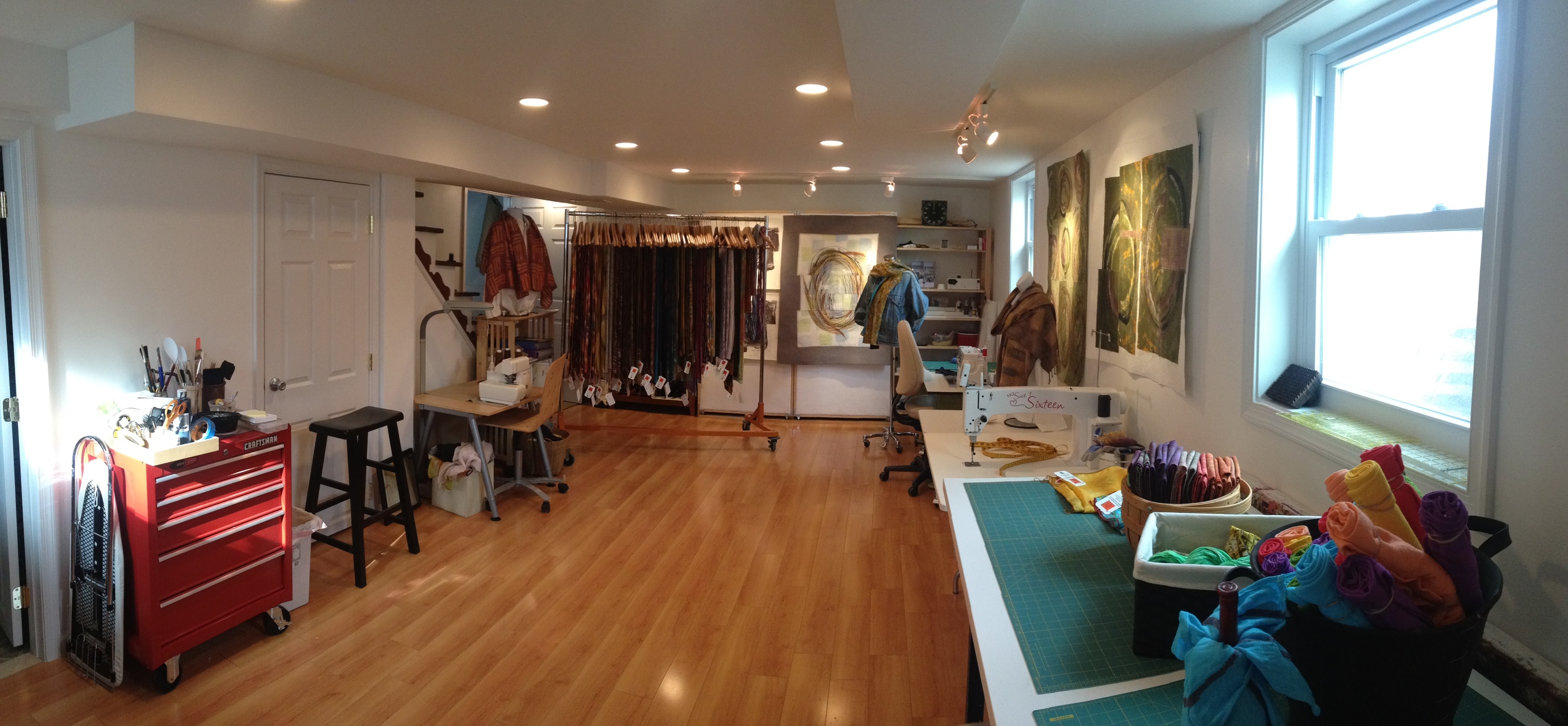
Yesterday we came home to the scene below. The new vinyl blank flooring is installed and the painting looks like it's just about done. With luck we'll be completely finished by Friday afternoon and ready to begin moving back in over the weekend. It's been a complete whirlwind--the flood was 2 weeks ago yesterday--but that's way better than the long-and-slow process that it could have been.

Acqua Alta: The Destruction of my Studio
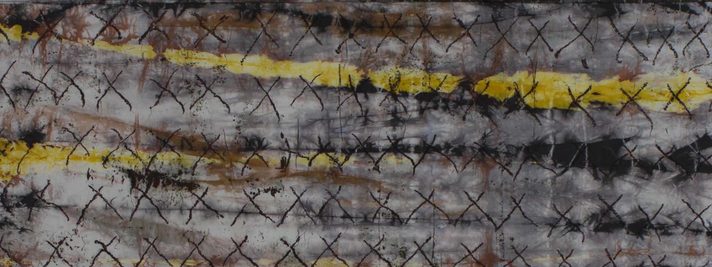
For hundreds of years the Venetians have lived with the waters of the lagoon--not next to or near, but with. The moon, tides, and storms combine periodically to inundate the city. I've been there to see it; it's impressive. The Venetians cope by donning their Wellies, assembling temporary elevated walkways, and, for the most part, living above the ground floor. The water goes away, they clean up, and move on. So why did I locate my studio in a basement space? Necessity, limited options--whatever--that's where it was. This past Tuesday we were hit with what will probably be called a "50-year flood event"--the second in about 5 years. You do the math. Here's a photo of Dan's weather station. Note that at 9:17AM we reached a maximum rainfall rate of 15.57 inches per hour. All told we got almost 7 inches of rain in less than an hour. And, that's where flash floods come from.

There were people in our neighborhood being rescued from cars trapped in 5 feet of water in an underpass where I've never see water. The storm drains were overwhelmed causing the drain at the bottom of our basement stairs to backup 2 feet of water outside the exterior door to the studio. We have a 2-pump system to deal with just this sort of emergency. It failed (long story; someone's fault; not the ours, the pump's or the pump contractor's). The net result was about 10 inches of water in the basement.
Here's the before. Pretty.
In the photo below you can see the water line along the exterior door. We're lucky that this was storm water and not sewage. Some neighbors and friends weren't so lucky.

I was able to save almost all of the dyed fabric. This is the beginning of a small mountain that formed in the driveway. I've got 4 garbage bags of ironing waiting for me, but it's better than a total loss.

Among the saddest losses was a stack of books I'd just started moving to the basement. Some were rare and out-of-print. It hurts to see any book ill-treated, and destroyed is that much worse. However, all of my workshop notes and dye sample books survived. When I say, "Thanks be to God" I mean every single word!

So we spent from midday Tuesday until midday Friday packing, cleaning, repairing damaged appliances, pumps, etc., and talking to adjustors, estimators, and other helpful folks.

Friday afternoon the cleaning and mitigation team arrived to rip up the floor and cut out 24" of drywall and insulation all the way around the studio and utility room, apply disinfectant, and setup industrial dehumidifiers and fans (many fans). Our contractor comes today to talk about rebuilding.

In the end we lost some stuff, a few small appliances (e.g., dehumidifier, condensate pump, vacuum, etc.), but the furnace survived and the hot water heater was repaired. Three of the four sewing machines are OK, despite having their foot pedals submerged (or floating). The fourth machine (my faithful and much loved Bernina 1090) was on the floor. I dried it out and it appears to be running, but acting a little strange. It's going to the repair shop today. I lost a big stack of wool suiting remnants, an entire bolt of felt, blah, blah, blah. Basically everything in a plastic tub survived. After this my whole life is going into plastic tube, ziplocks, and sheet protectors.
Dan and I are both grateful that it wasn't worse. "Why?" is not really a productive question at this point. However, "Never again!" might be a good battle cry. WSSC (the sewer people) has some explaining to do.
David Hornung's "Collage" workshop
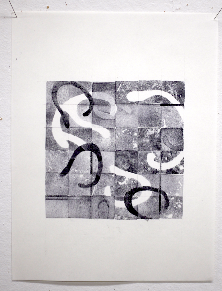
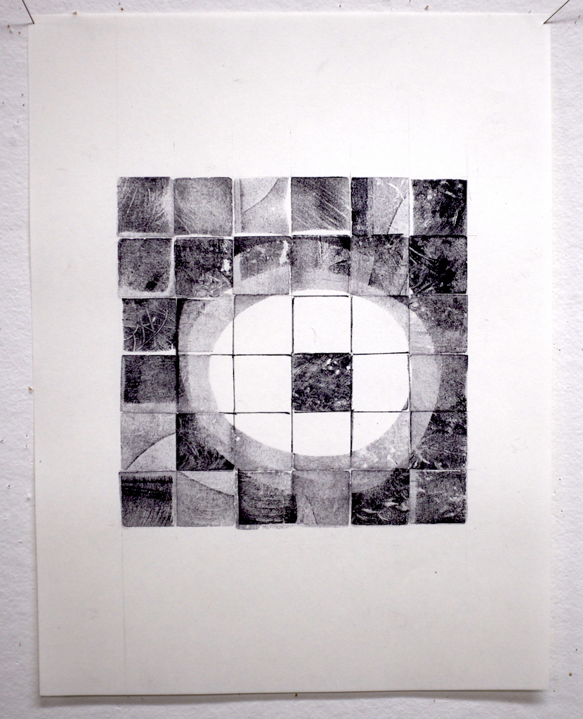
It's Wednesday, and a week ago today I was in David Hornung's "Collage" workshop at the Crow Timber Frame Barn in Ohio. It was the second workshop that I've taken with David (davidhornung.com), the other being "Color: A workshop for artists and designers" back in 2009. Where the color workshop was predominantly a carefully programmed and exercise-focused experience, the collage workshop was almost entirely unstructured studio time with a general rhythm of slide show, discussion, working, and critique. We started Monday morning with a sideshow and discussion of collage as a medium and looked at examples from previous students. It was only then that I realized that several of my fellow students were "repeat offenders", returning for a second year for another week with David. He's a good and gentle teacher, and I find that he's particularly adept at creating a peaceful and contemplative environment in the studio. I think that might come in part from his own habit of working in silence. It was a real treat to work in the beautiful sunny upstairs studio at the Barn with something like a dozen people, all of whom were able to work in relative silence for hours. I confess that I went into this workshop hoping for more structured design exercises. [As it turns out, I'll be getting that in a two week design principles class with David next spring.] As a result of the open ended collage composition assignments ("Try to make 3-6 compositions per day") I was free to follow whatever path I found myself on. And, the paths turned out to be interesting. The image below show most of the work that I completed in the week. They're all small studies, but they revealed some interesting things about my thinking and aesthetic sense.

A few observations:
- In spite of my obsession with circles, when you put an Xacto knife in my hand I seem more likely to cut a straight line. I should probably be more thoughtful about my choice of tools, and mix things up a bit.
- I'm analytical about my design (e.g, straight lines, numbers, math, balance, and carefully planned imbalance).
- I really enjoy neutral backgrounds.
- The drawn line combined with the cut/pieced/collaged line is beautiful. Others do this far better than I, but I love it in almost all instances.
- Linear does not have to mean tight.
- Nerdy is OK.

Toward the end of the week, having completed so many analytical compositions, I intentionally created some very loosely brushed paper that I could cut up and rearrange. The images below show the result. I think they are pointing to possibilities--heck the whole week is pointing to possibilities.
In sum, it was definitely time well spent. Many thanks to David and my fellow collage warriors for creating such as supportive and productive environment.


Carol Soderlund's "Neutral Territory"--way more than 50 shades of grey

I've just returned from two weeks at the Crow Timber Frame Barn in Ohio for two outstanding workshops, one with Carol Soderlund (carolsoderlund.com) and one with David Hornung (davidhornung.com). I'll write about David's workshop in a future post. This one is all about Carol's workshop, which was titled "Neutral Territory: 50 Shades of Gray + 50 Shades of Brown."
In her "Color Mixing for Dyers" workshop, Carol teaches the basics of full-immersion and low-water immersion dyeing with Procion MX dyes. The tangible products of the class are a head full of knowledge, Carol's stunningly detailed handouts, and THICK binder that her students affectionately refer to as, "The Bible". This reference volume contains thousands of dyed 1-inch square fabric samples (made in class) to document the cubic color model for several combinations of different yellow, red, and blue dye. It's amazing, and I use my notebook almost every time I'm in the dye studio.
So, why all of the description of a workshop that I took 6 years ago? Well, "Neutral Territory" builds on "Color Mixing." Every combination of three pure MX dye primary colors has the potential to create a neutral black, warm black, cool black, etc. The trick is finding the right proportions of yellow, red, and blue. What I'm telling you is that I paid good money to spend 5 days with Carol and 19 other students mixing untold numbers (way more than 50!) of very carefully formulated mixtures of dye searching for good black candidates, then creating 10-step gradations of the best candidates to see if what we thought was black was really neutral or had a hue leaning. And, we only scratched the surface of the 80 families (i.e., possible combinations) of yellows, reds, and blues. It was as much about the investigative method as it was about the end result. That said, I'm now the proud owner of another mighty sample book, which might come to be known as "The Apocrypha".
For me, the culmination of the workshop came late on the 4th day when I washed out some silk samples that I'd just discharged and realized that I'd managed to combine what I learned in this workshop with what I'd previously learned in Carol's "Dyeing to Discharge" and "True Colors" to select a dye combination, mix a black by eye, and create a predictable result that I've been wanting for some time now--a black that grades down to a silver-gray and discharges to near white. I love that feeling that comes when deep study in a subject area produces learning that all begins to overlap and intersect.

I count this workshop as another great week spent with an outstanding teacher and excellent mentor. If you have any serious interest in dyeing, I urge you to seek an opportunity to study with Carol. Rest assured, you'll be a better dyer for having done so.
I'm launching a new online series
I'm feeling the need to make a commitment to something that will feed my inner artist on a day-to-day basis. I still have a corporate job that keeps me busy most days and leaves me tired most evenings. And yet, I'm also very committed to growing as an artist. Part of that growth is keeping the creative fires stoked on days when I'm not able to be in the studio. Several years ago my friend Sherill Gross (http://sagworks.wordpress.com) embarked on the ambitious project to created a completed work for art almost every day for an entire year. The result was a wonderful series of cut paper works and an accompanying book titled, "2007 one-a-(week)day." Sherill inspires me on many levels, high on the list being her dedication to her craft.

I'm setting the same challenge for myself, but keeping it simple. I'm totally enthralled with TileDeck, an iOS app that let's you create color doodles that you can then arrange in various different tessellation patterns. It's really cool; perhaps even a little addictive. So here's what I'm going to do (at least what I'm planning to do): I will create and post one new pattern every day for the next year. That's all--just one image each day; no narrative. I just realized that I'm holding my breath and sitting on the edge of my seat as I type this. That means something. I think it's apprehension. This project won't be demanding work. On the contrary, it's going to be fun. The apprehension I'm feeling is about making a commitment to myself that I might fail to keep. But, that's casting myself a bit too far into the future. For now, let's just make a start...
You can see the daily posts here or by clicking the "365 patterns" link under "Portfolio" in the menu bar, above.