Lessons from my 365: Sometimes less is more
As with dessert, so too in design, it's very often true that less is more. Cleaner lines, fewer colors, and broader strokes are often easier on the eye (at least my eye) and more engaging. But when do you know that you've arrived at "enough" and not tripped over the line into the land of "too much"? Trial and error, time, practice, and honesty with yourself.
There's a wonderful yiddish word, ungapathka, which means overdone, excessively decorated. Think "cat sweatshirt attached with a bedazzler." While I claim no legitimate cultural connection to the language, I do love this word, and I think it captures the essence of "too much."
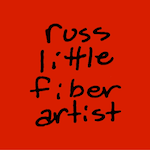
Consider the two designs below. The one on the left uses just two colors, and there's a balance between lighter and broader line weights and a mixture of lines and shapes. By contrast the design on the right--well, it lacks contrast. The designer (me) just kept adding more and more detail trying to breathe life into a muddied background with too little attention paid to the scale of the marks. Yes, there's a symmetry and an inner structure, but you've got to work too hard to perceive it, and meanwhile your eyes dance all over the place.

