Busy, busy (with pictures)
Oh, there's just too much going on. I'm going to spare us all the details right now and just hit the high points.
It was a bad week on the creative equipment front: the printer died and was followed very soon by the serger. Given the low cost of a new printer and the age/quality of my 15 year old serger, I opted to replace both. So now we have a lovely new Canon printer that was delivered in under 48 hours by the nice folks at Adorama (www.adorama.com -- an excellent source of photo and printing equipment).
After a bit of Internet research, I scooted over to the sort-of local Baby Lock dealer. I am now the happy owner of a Baby Lock Imagine. So far it's done a great job with a rolled hem on two silk habotai scarves and a couple of napkins.
Here are the scarves. I'm very happy with both. I've never been able to make up my mind about whether or not there's a place for me in art-to-wear. I think I might be finding it. The scarf is a basic form that I think stays as true to the cloth as possible while still being wearable. The first one is finished.
I've already finished the edges on this second one, but I'm considering working back into it with some discharge--maybe more. It's lovely in person, but the more I look at it here, the more it looks half-baked.
I got some other good printing done last weekend, still riding the wave of inspiration from Kerr's workshop. I'm pleased with what I've been doing lately because I feel like the color thing is working a bit better for me. I'm spending a lot more time considering and mixing colors, and what I learned in Carol Soderlund's class is proving very helpful. The green and purple piece below is a good example. I have problems with mixing the whole violet range. In this case I knew what I wanted and I came close enough to be delighted with the result. I think this yardage might find its way into a piece that's starting to germinate in my head.
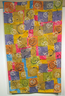
Finally, I had a "cute" piece of batik from last December that looked rich on the print table, but lost a lot of the dye in the washout. Here's the link for my December 29 posting that shows it in process. I don't have a picture of the faded version, but just image all those strong colors going pastel. The image below shows what happened with some deconstructed printing over top. I like where this is going, but I'm not sure what comes next.
June is full of potential and I'll try to be a bit more regular in my blogging. Stay tuned. -R


