
Thoughts, news, and more
Recent posts


Elements of Design: Day 6
Dan and I had a wonderful weekend together, but this morning it was back to the Barn for week 2 of Elements of Design. David gave a great lecture on art paradigms and their historical context, which helped put our work these two weeks into context.
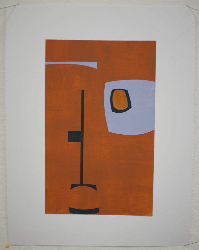
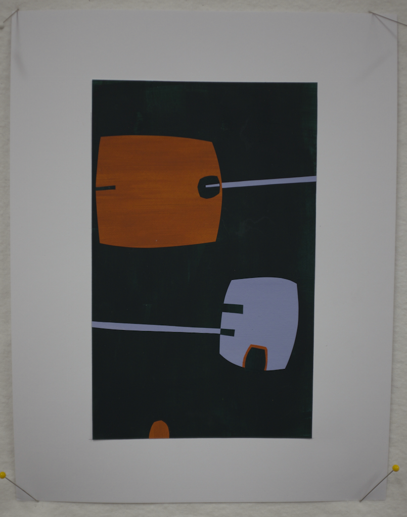
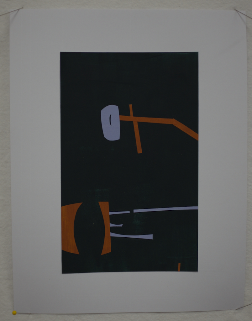
Today's exercise was shape composition in color. We were presented with some basic ground rules: A palette of 3 colors, a consistent bounding size, and a limited range of shapes. It might seem hard to believe, but it took 10 hours with a couple of short-but-not-hurried food breaks to complete the work below. Part of it is just the time required to paint all of the paper, then the gluing is a bit fussy time-consuming. But, I'm happy with the result, I'm applying the design principles more readily, and I feel like I'm getting my groove back.
Tomorrow morning, more colors and a bigger design frame.


Elements of Design: Day 5
This is getting harder, but I guess that's good. Perhaps it's also true that I'm getting tired. Today's exercises focused on the interaction of shapes with each other and with the negative space. The assignment was to make a series of 7x7" compositions using just 3 shapes in each, being mindful of interaction with the perimeter of the design space, varying shape scale, carving out lively negative space...the list went on.
So, here are some of the results, none of which met with particular critical acclaim. I'm trying to be mindful that there's often more to be learned from negative feedback than from praise. But, there's also a little, but rather insistent, voice in my head saying that it's very good to please the teacher. This is not the most helpful of my many internal voice.
The image below shows my first angular composition, which I tossed on the reject pile, only to be told later that it was better than my second attempt.

Here's that second attempt. I believe the feedback was along the lines of, "tight, static, vacant, and predictable." Ouch, but not inaccurate.

"Leaden," was the word for the following image. I'm struggling a bit with proportion. I love the quality of the curves, but I understand the comment. At least he didn't say, "phallic," which was not my intent.

I'll spare you the rest. Let's just say that I've got room to grow, and that's what next week is for.
For now, Dan is here. He arrived last night, and we're going to spend the next two days playing, eating, shopping, and relaxing in and around Columbus, including a trip to Athens tomorrow to see the Quilt National show. It's nice to be physically present in the same place at the same time. Between his travel and mine we've seen each other about 36 hours in the last 3 weeks.
Elements of Design: Day 4
As promised, today we began our discussion of shape, but not before a morning spent almost entirely with that same blasted 1X1" stamp. There's something to be said for deeply embracing the tool at hand--or in this case the one provided--but I'm really done at this point.
I started out revising my last piece from yesterday after consulting with David. I think it's greatly improved. More importantly, I understand why it's better.

Our final "official" challenge with the stamp was to create a design that referenced a surrounding border, again emphasizing size and tonal/depth relationships. I'm fairly pleased with the result. An early version was deemed "unfinished" during a late morning critique. I feel it's adequately resolved now, but that's just my opinion (which does count for something).

By afternoon we were discussing shape and creating cut paper inventories of different categories of shapes (angular, biomorphic, and synthetic). These concepts will be the starting point for tomorrow's compositions.

We've also started painting colored paper for next week's color compositions. There's a sort of zen quality to this preparatory work: mix the color, paint the paper, repeat. Think "wax on; wax off." It was a nice end to a kind of frenetic day that included a lot of what I'll call "adult learning moments" in which we asked lots of questions and didn't always understand the answers. Let's just say that adults who are paying to learn have a strong commitment to getting what they came for.

Elements of Design: Day 3
Today's topic was pattern. You would think that repeating patterns would be a walk in the park for a group where most everyone works in some sort of quilted textile form. Not so. Most of us made a few traditionally pieced quilts then followed our natural inclination away from that sort of structure and pattern. There was a good bit of grumbling today. But, this is supposed to be about learning to solve design problems.
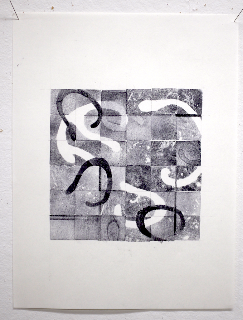
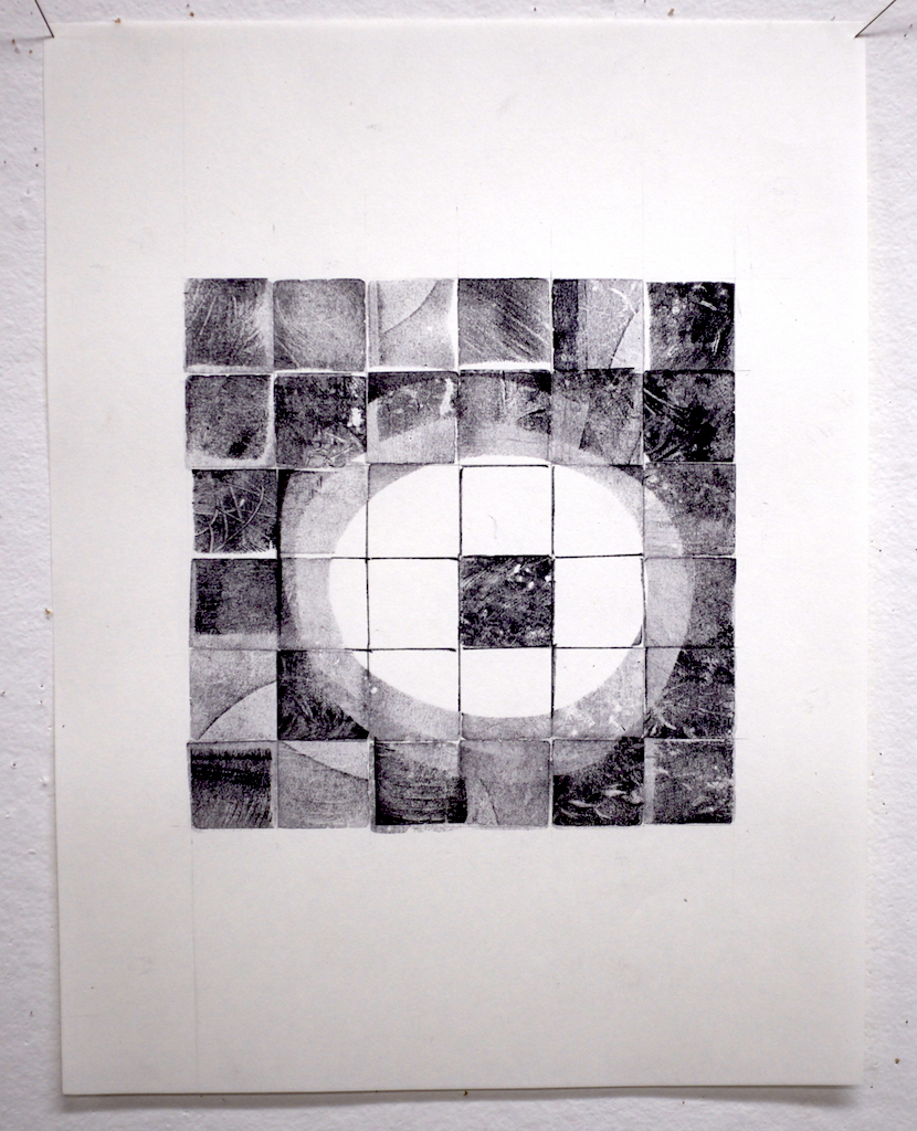
All day we worked with a single blank 1x1" stamp. The first exercise was to develop a series of 4x4 patterns, pick the "best," and use that to build a 3x3 regular repeating pattern, including some combination of overlap, light, dark, and mid-tone values, and masking.
I'd rate my result as so-so.

The next assignment was to build an irregular pattern. I think that my result is only only subtly irregular. And, I can say that by now I was starting to not like being constrained by this particular 1x1" tool.

To the relief of all, our final assignment was to continue working with the same 6x6 grid of 1"squares and begin layering, using the grid as a foundation with which to interact. My two efforts thus far appear below. The second is definitely the more successful of the two. I think there will be time for one more run at it tomorrow morning before we move on to the next topic: Shape.
Elements of Design: Day 2
Today we continued our exploration of line, with emphasis on using line to build structure.
This is what I was thinking yesterday. They look like root forms, and I'm completely in love with the quality of the fine lines.
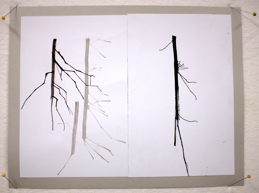
This morning, switching from ink to charcoal and pencil, we produced another round of line studies. The study below shows the same branching structure that I've been fiddling with in a combination of ink, pencil, and charcoal. The same branching structure is there, but it's simplified.

By afternoon we were working on creating thumbnail ink sketches of structures built from lines. A couple pages of these resulted in the idea at bottom right. The branching structure has simplified into sort of a budded stem.

Then we explored variations on an individual design with more thumbnails in black, white, and a mid-tone gray. Clearly some of these are better than others!

And finally, we did a larger scale rendering (6x6") of one design...

...which we then produced as a cut paper collage. I have to say that I'm pleased with both the process and the result. It's really nice when it turns out that way in a workshop, and a fine way to end the day.

At the Barn for "Elements of Design & Composition" with David Hornung
I'm in Ohio (about 45 minutes east of Columbus) for the next 2 weeks at the Crow Timber Frame Barn studying with David Hornung. Not having been an art major in school, I've never had a formal 2D design class. This is a chance to spend some quality time with a great teacher and a group of tremendously talented students focused on learning and relearning those fundamental principles of line, shape, etc.
Day 1 was all about line quality and tools (stick, brushes, straws, and more). Here are two line studies. I'm hoping to bring home a nice little portfolio and a lot of learning.


Lessons from my 365: A simple graphic palette promotes clarity
I love rediscovering things that I've always known, but sort of lost in my cluttered brain. Simplicity is on of those things I keep rediscovering, and every time I do, it brings me up short. Consider the designs below. Each is limited to a palette to 2-3 colors. The colors are also even or level, meaning that they aren't mottled or blotchy with visible brushstrokes. The result is that in each case there's a fairly clear relationship between figure and ground, and there's a clarity and crispness to the design.
Limiting the palette to a few discrete colors and rendering those colors evenly is key to this success.
What if you were to create a design that featured, let's say, 100 values of red, from pale pink to deep burgundy? Yes, they would be discrete colors, and they would also be from a limited hue range. It's certainly possible to use all 100 of those colors in a single design. It could be lovely. Such a palette could also allow you to create wonderful depth and transparency, but probably not the crispness of a limited palette.
You can see the same principle at work in a B&W photograph, which essentially a design using grey values from white to black. A low contrast image might appear flat or subdued, which the same image rendered at a higher contrast will appear more lively. One is not better than the other. It all depends on the artist's intent.


Lessons from my 365: Complementary colors add definition
Let's start with a few fun facts about complementary colors:
- Two colors are said to be complements of one another if they are located opposite each other on the color wheel. For example, red and green are complementary colors.
- The complement of a primary color (red, blue, yellow) is alway a secondary color (green, orange, purple) made up of the other two primaries. For example, yellow and purple (red + blue) are complements.
- Mixing two complementary color theoretically produces a color between grey and black. In practice, it's more likely to produce a chromatic grey that will probably have some bias toward a primary or secondary.
- Of course, all of this only applies when you're dealing with what's called a subtractive color model--like mixing paint or dye. The way that your computer monitor works--additive color--is a different thing.
Knowing all that, consider the designs below. The first thing I see is contrast. And, in fact, there are no two colors more different from one another than a complementary pair. So, contrast is a powerful tool in design because it leads to definition of shapes and lines.
Another thing you can expect to find in a design that features both transparency and complementary colors is a strong values created where complements overlap and combine. These value shifts can be used to add vitality, movement, and depth to a design.


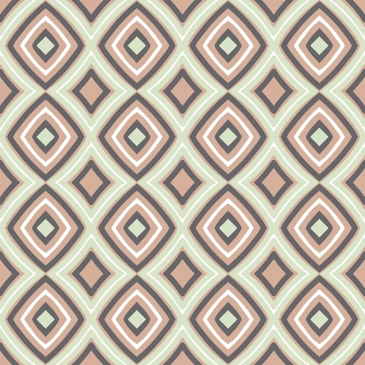


Lessons from my 365: Transparency is a powerful tool. I just wish it was easier with dye.
The transparent affects that you see in the images below are just wonderful to my eye. In most cases, the transparency that you're seeing is similar to the effect you'd get from painting with an acrylic paint mixed with transparent medium.
Disclaimer: These images were created on a computer, and there's a bit more going on here than simple transparency. But I'm still using them to illustrate the difference between layering paint versus layering dye.
Painting a light color over a dark color produces a combination of the two colors because the base color shows through the transparent second layer. Applying multiple layers of transparent paint (seen clearly in the 3rd image below) increases the opacity of the transparent color. For example, applying multiple layers of transparent white paint over a dark background makes the white areas whiter with each successive layer.
Unfortunately (or fortunately, depending on your perspective), layering dye doesn't work the way layering paint does. All dye is transparent, and thus each layer is added to the previous layer. In this way, dye on cloth is most akin to watercolor paint on paper. You can never overlay one dye on top of another and get a lighter result. Building complex layering of color on dyed cloth requires thoughtfully planning the concentration of the dye solution and the order of layering, understanding the way that dye binds to fiber, and knowing how dye can be manipulated through resist and discharge techniques.
Some of the wonderful effects in these designs would not be achievable using the same layering I used to draw them on my iPad. Some would be just about impossible to achieve. Enter now the brave new world of digitally printed cloth, which opens all of these possibilities and then some. I could send any of these designs to a printer and have them rendered on cloth using a wide carriage inkjet printer
Having said all that--paint, versus dye, versus digital printing--while there are merits to being able to design complex transparency on a computer and print it directly on cloth, there's also a satisfaction that comes from intentionally or serendipitously creating complex layering through hand dyed processes.
It raises big questions through. Is the artist's hand less present in length of cloth printed on a computer-driven printer versus printed by hand? I say no...and yes...and no. And, I continue to wrestle with this question as I produce both hand dyed cloth and computer printed cloth.

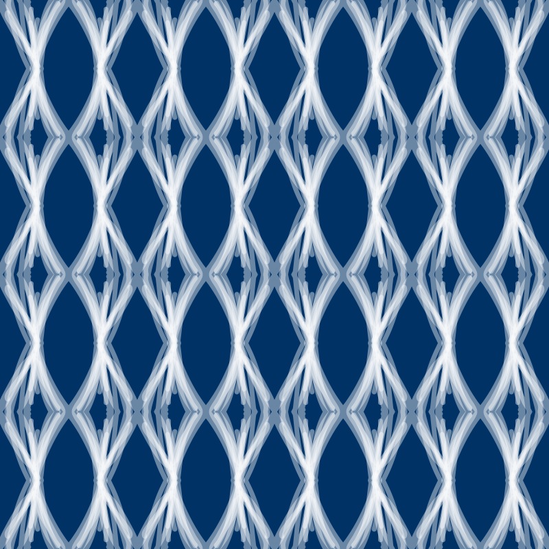


Lessons from my 365: 3 values of the same hue
A monochromatic color scheme includes only one hue, but there's nothing that says that every element in the design needs to be the same value of that hue. In fact, very successful designs can be created by manipulating the value of a single hue. Moreover, 3 values seems to be a sort of magic number. Consider the following designs. In each case, just 3 values of a single hue have been used, and yet, the designs are fresh, clean, deep, and uncluttered. These designs are among my favorites from the set of 365.


