How to use a design wall
Two of an artist’s most valuable tools are a design wall (easel or some way of viewing your work vertically) and a camera. I worked for years without a design wall. I arranged quilt blocks on the guest bed or the floor and it seemed to work OK. As I moved away from traditional quiltmaking, I kept my old habit of just throwing things on the floor or on my studio work table. Now I know better.
The design wall
Viewed at an angle on a table, your work is subject to the optical effect of foreshortening and other distortions. You might think that you’re getting a proper look at things, but you’re really not. I’ve been known to put something on the floor and stand on a stool so I could look down at it. But, rather than risk breaking your neck falling off a stool, doesn’t it make more sense to put the work on the wall? Search the web for ideas about how to create a permanent, temporary, or movable design wall. The design wall in my studio is just foam panels attached to the wall. To that I’ve pinned a piece of white flanel. Fabric sticks to it like glue and I can pin into it if I’m layering fabric.
The camera
A camera–or a smartphone with a built-in camera–is an invaluable design tool for a several reasons:
- First, it allows you to see your work from a distance. I find the small screen of a phone better than any reducing glass for revealing those design flaws that only show up from a distance.
- Second, it allows you to capture different stages and variations in your composition as you work. Have you ever arranged elements in a design, then tried to “fix” or “improve” it, only to realize that where you started was better, but you just can’t find your way back to that starting point? Take a quick picture before you start rearranging and you’ve got a record of where you started.
- Finally, if your camera has a setting for black & white, then you’ve got a great tool for helping you assess value–the darkness and lightness in your composition. Squinting your eyes when you look at a design can also give you a sense of value. A few hours of that can also give you a terrific headache. Use the camera.
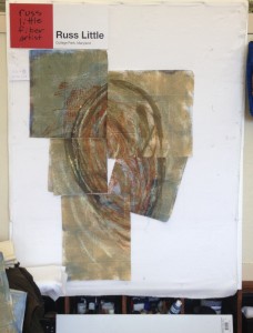
Here’s an example of a design starting to come together on my design wall.
Step 1: The fabric is placed on the wall. Some of it’s folded and tucked as necessary to start to create a composition. I don’t even need a B&W image to tell me that white space in the middle needs to go.
Step 2: This looks better, but it’s rather top-heavy. Sometimes that’s good; this isn’t one of those times.
Step 3: I’ve added another piece to the lower right to adjust the visual balance.
Step 4: Finally, my eye is drawn to the diagonal line on the right in the image above. Instead of helping my eye move through the composition, I feel stuck in that spot. A little reshaping addresses the problem.
Is it done? Probably not, but I hope you get the idea that there’s significant value in seeing your work vertically and from a distance.
And, don’t forget the grayscale image as a value check. In this case, I used my computer to convert the image from Step 4 from color to black and white. However, I could have done it on my phone in the studio for a realtime evaluation of value issues in my composition.


