Finished commission work
I picked up a commission for some dyed and printed yardage a while back and was worried that I would never be able to fit it into my schedule. I'm happy to say that I did fit it in and am delighted with the results. Let's just hope the client shares my enthusiasm.
Both pieces are viscose rayon challis. I've sourced this cloth from Test Fabrics and Dharma and they are different. The Dharma cloth is the same that they use in their rayon garment blanks. It's got a nice hand and the sort of drape that you expect from rayon. The Test stuff seems a bit courser. Both are nice but the Dharma seems better suited to garments, which is the ultimate use for these commission pieces.
So, here's the first piece. I used a mixture of low water and full immersion, plus some direct dye application. The client requested deep purple with highlights of blue and other jewel tones. I think I hit the mark. I have to give credit here to the color mixing techniques that I learned from Carol Soderlund. I picked the purple I wanted and I got it. I have to admit that I'm going to be sorry to see this go away. I could make some cool stuff out of this.
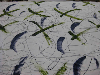
The second piece is printed. The request was fantastic. It's what all artists dream of--something to the effect of, "I love your work and I love strong color...go for it." For this one I've got in-progress shots.
First, some energetic black lines and broad painterly marks to create a strong foundation and establish the beginning of a color palette.
This cloth is going to become a shirt, so I had to rein in my desire for large-scale pattern. In the next shot you can see the 3rd, 4th, and 5th dye applications. the brown squares (ProChem Kahki) were screened with screen that I "damaged" earlier this year by leaving water soluable glue resist in it for too long. Now whenever I print with it I get these ghost patterns. It's one of the most productive mistakes I made in a while. The circles came next to expand the palette and pull the counter balance out the angles of the squares with some curves. The 5th layer was a screening of blue dots over the entire surface (seen in the background).
I might have been able to stop with that, but I was concerned about the strong contrast of the white background. A blue background was the perfect solution. The only problem is that I couldn't do that as a dye bath without altering many or all of the other colors already layed down. So...I spent a day hand painting the whole thing. It was the right thing to do, but very time consuming.
The washed version of the cloth is pretty much the same. Of course I had some dye loss, but generally got very good strike--gotta love that rayon.
Because these two pieces will be made into shirts, and because the dyerslist e-mails this week have been full of good reminders about the need for high-temperature washout for reactive dyes, AND because I didn't want to dye my client and his partner shades of purple--I soaked both of these pieces in 180 degree water. I was surprised by how much residual dye came out, but even after a final long wash cycle they both look bright and strong. I don't generally do REALLY hot washouts, but might need to reconsider that in the future.


