
Thoughts, news, and more
Recent posts

Lessons from my 365: Complementary colors add definition
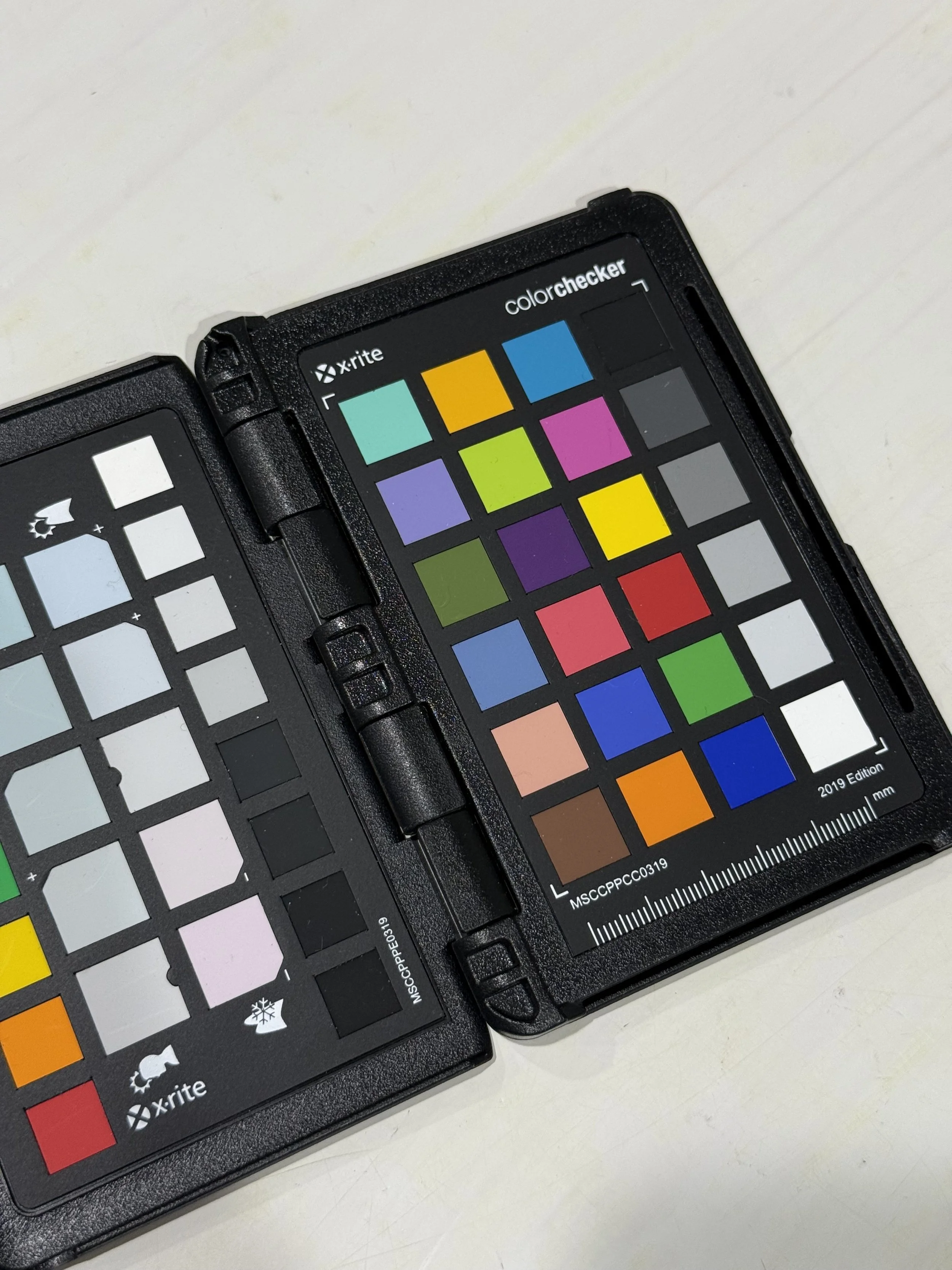
Let's start with a few fun facts about complementary colors:
- Two colors are said to be complements of one another if they are located opposite each other on the color wheel. For example, red and green are complementary colors.
- The complement of a primary color (red, blue, yellow) is alway a secondary color (green, orange, purple) made up of the other two primaries. For example, yellow and purple (red + blue) are complements.
- Mixing two complementary color theoretically produces a color between grey and black. In practice, it's more likely to produce a chromatic grey that will probably have some bias toward a primary or secondary.
- Of course, all of this only applies when you're dealing with what's called a subtractive color model--like mixing paint or dye. The way that your computer monitor works--additive color--is a different thing.
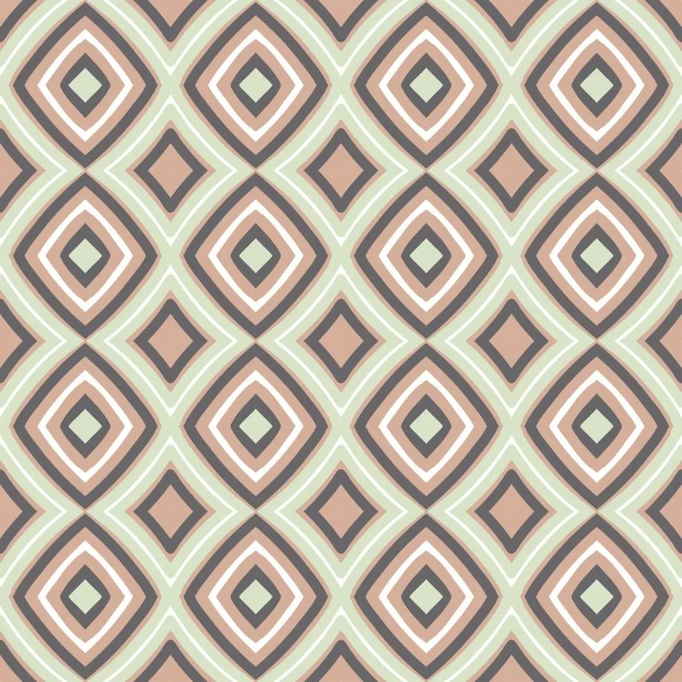
Knowing all that, consider the designs below. The first thing I see is contrast. And, in fact, there are no two colors more different from one another than a complementary pair. So, contrast is a powerful tool in design because it leads to definition of shapes and lines.
Another thing you can expect to find in a design that features both transparency and complementary colors is a strong values created where complements overlap and combine. These value shifts can be used to add vitality, movement, and depth to a design.




Lessons from my 365: Transparency is a powerful tool. I just wish it was easier with dye.
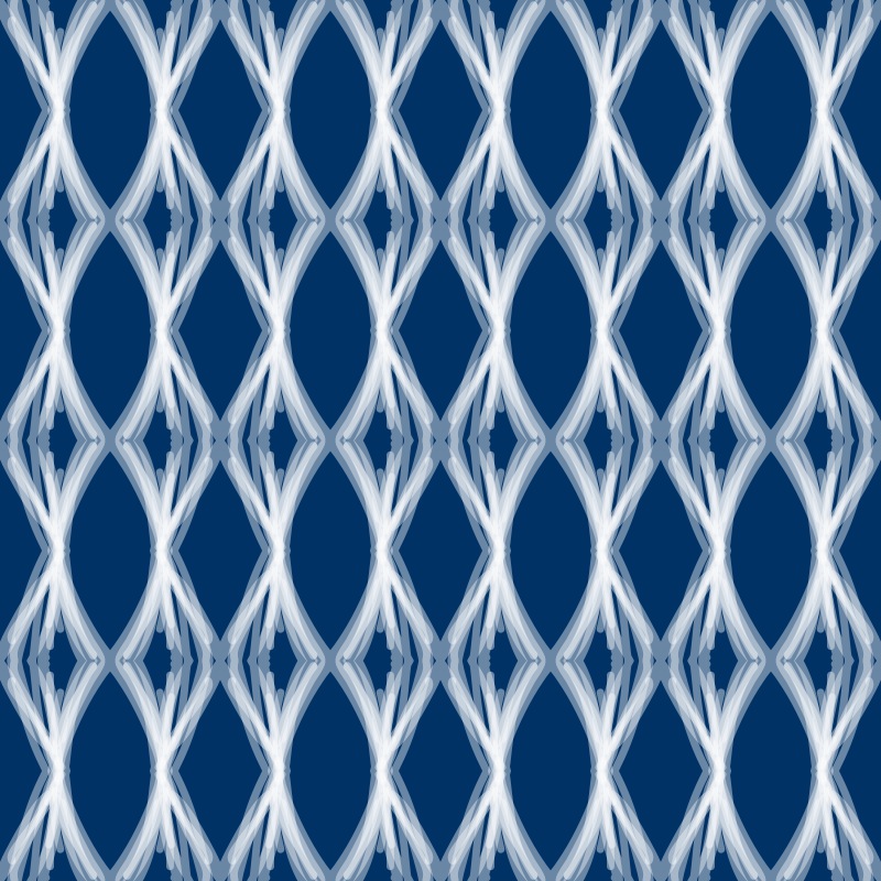
The transparent affects that you see in the images below are just wonderful to my eye. In most cases, the transparency that you're seeing is similar to the effect you'd get from painting with an acrylic paint mixed with transparent medium.
Disclaimer: These images were created on a computer, and there's a bit more going on here than simple transparency. But I'm still using them to illustrate the difference between layering paint versus layering dye.
Painting a light color over a dark color produces a combination of the two colors because the base color shows through the transparent second layer. Applying multiple layers of transparent paint (seen clearly in the 3rd image below) increases the opacity of the transparent color. For example, applying multiple layers of transparent white paint over a dark background makes the white areas whiter with each successive layer.
Unfortunately (or fortunately, depending on your perspective), layering dye doesn't work the way layering paint does. All dye is transparent, and thus each layer is added to the previous layer. In this way, dye on cloth is most akin to watercolor paint on paper. You can never overlay one dye on top of another and get a lighter result. Building complex layering of color on dyed cloth requires thoughtfully planning the concentration of the dye solution and the order of layering, understanding the way that dye binds to fiber, and knowing how dye can be manipulated through resist and discharge techniques.
Some of the wonderful effects in these designs would not be achievable using the same layering I used to draw them on my iPad. Some would be just about impossible to achieve. Enter now the brave new world of digitally printed cloth, which opens all of these possibilities and then some. I could send any of these designs to a printer and have them rendered on cloth using a wide carriage inkjet printer
Having said all that--paint, versus dye, versus digital printing--while there are merits to being able to design complex transparency on a computer and print it directly on cloth, there's also a satisfaction that comes from intentionally or serendipitously creating complex layering through hand dyed processes.
It raises big questions through. Is the artist's hand less present in length of cloth printed on a computer-driven printer versus printed by hand? I say no...and yes...and no. And, I continue to wrestle with this question as I produce both hand dyed cloth and computer printed cloth.



Lessons from my 365: 3 values of the same hue
A monochromatic color scheme includes only one hue, but there's nothing that says that every element in the design needs to be the same value of that hue. In fact, very successful designs can be created by manipulating the value of a single hue. Moreover, 3 values seems to be a sort of magic number. Consider the following designs. In each case, just 3 values of a single hue have been used, and yet, the designs are fresh, clean, deep, and uncluttered. These designs are among my favorites from the set of 365.


Lessons from my 365: Sometimes less is more
As with dessert, so too in design, it's very often true that less is more. Cleaner lines, fewer colors, and broader strokes are often easier on the eye (at least my eye) and more engaging. But when do you know that you've arrived at "enough" and not tripped over the line into the land of "too much"? Trial and error, time, practice, and honesty with yourself.
There's a wonderful yiddish word, ungapathka, which means overdone, excessively decorated. Think "cat sweatshirt attached with a bedazzler." While I claim no legitimate cultural connection to the language, I do love this word, and I think it captures the essence of "too much."
Consider the two designs below. The one on the left uses just two colors, and there's a balance between lighter and broader line weights and a mixture of lines and shapes. By contrast the design on the right--well, it lacks contrast. The designer (me) just kept adding more and more detail trying to breathe life into a muddied background with too little attention paid to the scale of the marks. Yes, there's a symmetry and an inner structure, but you've got to work too hard to perceive it, and meanwhile your eyes dance all over the place.


Lessons from my 365: Not every design is a winner
Well, doesn't this seem like a good place to start as I consider what lessons I might learn or re-learn from my recently completed "365 Patterns" project? Just because I put pen to paper, brush to canvas, or press the shutter release button on a camera doesn't mean the result is going to be a great work. Consider the following two images. I probably spent about the same amount of time on each, but the one on the left clearly has color issues and just isn't anything too special. The on the right is better: more depth, better positive/negative space relationships, and just generally more engaging.


So, what's to be learned from this confession? I think it's these thoughts:
- Do prepare to work by taking a few minutes to clear your mind and settle your body. This is my single biggest challenge.
- Do practice, and in doing so, sometimes work rapidly.
- Do balance rapid work with slower and more contemplative work.
- Don't become overly invested in the result before the process has even begun. "I will now create a successful work of art?" is a burdensome point of beginning at best, and more often than not the first step on the road to disaster.
- Don't loose sight of the fact that at some point there's greater value in working--regardless of the outcome--than in merely contemplating the work. Spend time with your thoughts, then get out of your head and do something.
- Do value the learning that comes from making mistakes and doing work that turns out to be less than expected.
My 365 project is nearing completion
It's hard to believe that my 365 Patterns project is almost complete--an entire year of this. Actually, if I'm being totally honest it's already. All of the posts from now through April 15 are queued up to automatically publish at Noon each day. That's sort of the way the year has gone. Sometimes I've truly done one per day, and other times I've finished them in batches. I've learned quite a few things along the way, and I'm hoping to spend a bit of time reflecting on and sharing those lessons over the next few weeks.
Fantastic 2014 Festival of Lights

Dan and I spent the last two days doing the Greenbelt Festival of Lights Craft Show, which was a huge success. It was great to connect with so many new and returning customers and enthusiastic supporters. Thanks to everyone who made the event a highlight of the year, especially my awesome booth neighbors and the outstanding staff at the Greenbelt Community Center.
Yet another website redesign
I've lost count. I think I'm on my 5th web platform. I don't know if it's an insatiable curiosity about technology, a quest for better design, or just plain stupidity. Maybe it's a bit of all three. Whatever the case, welcome to the new site, which is still functional but still a bit under construction. Watch over the next few weeks and see how things take shape.
In case you're wondering, this latest iteration is built on Squarespace.com. The design aesthetic is a pretty big selling point. But I can also say that having built and run a Wordpress site for 2 years (including substantial coding), I'm ready to go back to something a little simpler. I'm a big fan of Wordpress, but there's just too many ways to get into trouble with it.
Greenbelt Festival of Lights just 2 weeks away

Visit my booth at the Greenbelt Festival of Lights Art & Craft Fair Dec 6-7th where I'll be selling original art cloth scarves. This is always a wonderful event and a great opportunity to shop locally, support makers and small businesses, and save money by purchasing directly from the source. It's hard to believe that this will be my 4th year participating.
Progress: drying out + rebuilding
We're making amazing progress on recovering from the flood. Damage to my Bernina 1090 was worse than I thought, but less than it could have been. Two motors and a full overhaul later, I've been told by the repair guy that it's performing very well. I'm hoping to see that for myself this weekend. The insurance company has been great about getting us through the cleanup and inspection process and providing funds to start the repair. Just as amazing was the fact that our general contractor was able to fit us into his schedule earlier than he anticipated. So, we're very far along with the rebuilding.
The basement got a little worse before it got better. After the old tile floor was exposed and thoroughly dried we began noticing a few loose tiles. By "a few" I mean just about all of them. That meant removing all of the tiles and disinfecting the cement floor underneath.

Yesterday we came home to the scene below. The new vinyl blank flooring is installed and the painting looks like it's just about done. With luck we'll be completely finished by Friday afternoon and ready to begin moving back in over the weekend. It's been a complete whirlwind--the flood was 2 weeks ago yesterday--but that's way better than the long-and-slow process that it could have been.
