Thoughts, news, and more
Recent posts

Dye doesn’t die, but it does get tired
This is a techie article about dye and about some recent work I’ve done. I think it’s still of some interest to non-dyers, if only as a way of gaining insight into what goes on in the nerdiest parts of my brain. If this just isn’t your thing then I completely understand. Watch for a new posting on some other topic later in a week or two.
—————
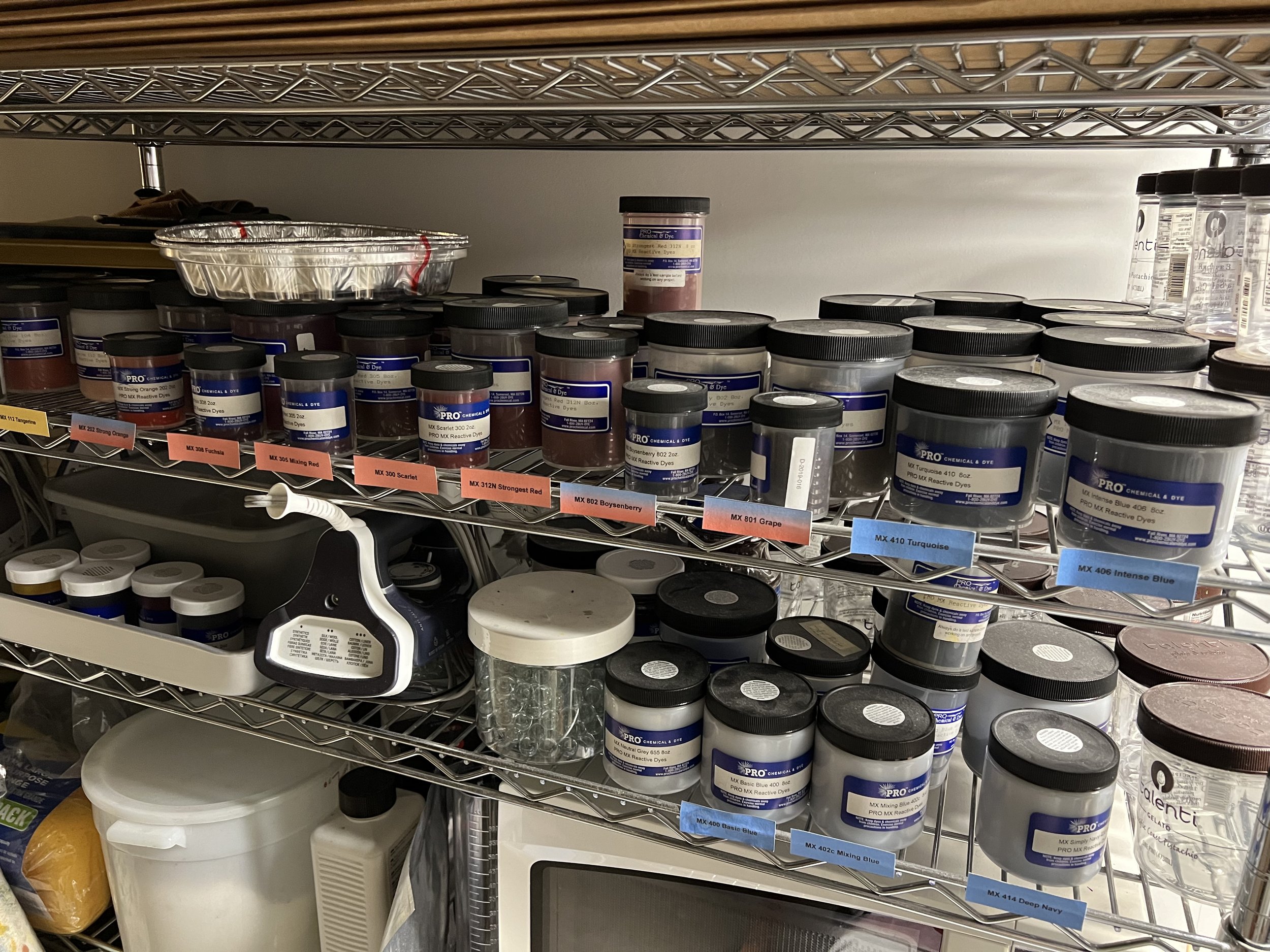
So, here’s the thing: I have a lot of dye (no pun intended). What you see on those shelves are jars of pure MX fiber reactive dye powder. These various yellows, reds, and blues can be combined to produce a rainbow of colors. I know that some of the jars are 13 years old, and others—the first ones I purchased—are probably 1-2 years older than that. I used to do a lot more dyeing than I do today, especially when I was making and selling wearable art scarves.
Why so many jars?
I wasn’t far into my career as a dyer when I learned that MX dye has sort of a a shelf life. I say “sort of” because the dye powder in everyone of those jars can be used to put color on cloth, regardless of age. However, MX dye loses some of its tinctorial strength as it ages. By that I mean that the intensity of color (referred to as depth of shade, DOS) produced by a gram of powder from an older jar of dye will produce less color than an equal amount of dye powder from a new jar. That change can be observed in a year, perhaps less when you consider storage conditions (temperature, humidity, light(?), and tightness of the jar lid). So again, why so many jars? Well, I have binders full of 1” x 1” fabric swatches created with known and reproducible formulas. All of the swatches were created with fresh dye powder, and reproducing those exact colors requires equally fresh powder. As such, when getting predictable color was very important I got in the habit of purchasing new dye about every 1-2 years. That didn’t mean that I’d used up all of the dye I had, so it started to build up. I couldn’t just throw the stuff out. Right?
A short digression about my sample books. These books, and pretty much everything I know about dyeing, came from years of study with Carol Soderlund. She’s the dye muse for more textile artists than I can count. If you want to learn to dye and really understand what you’re doing then seek our her classes.)

A portion of a page from my Soderlund sample book that I created years ago in “Color Mixing for Dyers”.
What to do with all that dye
Perfectly reproducing a known color can be very useful, but it isn’t always essential. Sometimes just getting color onto the cloth and then figuring out what to do next is enough, and older dye can be great for that.
Obviously, there are other times when getting a more predictable result is preferred, but maybe getting into the right neighborhood on one of those dye sample pages can be enough. But, what if an individual older dye has lost half or more of its tinctorial strength? That could (and does) mean that mixing secondaries (oranges, greens, and violets) as well as subtly toned hues from old primaries using known proportions will produce results that are unexpected and usually disappointing. You’d end up getting the wrong hue and probably a weaker overall value than expected. In fact, that’s exactly what happens.
For these reasons I’ve been ignoring my older dyes and feeling stuck on the fence about what to do with them. Recently I began to wonder what would happen if I could quantify the loss of strength in a given jar of dye powder. If I knew how much more dye was required to produce a result comparable to new dye then couldn’t I adjust my color mixing proportions to account for that difference? The answer is yes
What I did and what I learned
I knew that I needed a baseline against which to measure the change in my older dye. In my case that was my Color Mixing for Dyers sample books. I also realized that, while dyeing swatches using the sample book recipes but old dye would allow me to see that the dyes have weakened, it wouldn’t give me a way of quantifying that change. For that I would need a gradation of values dyed using the older dye powder. Steps along that scale from light to dark could be matched up with swatches in the sample book and would give me a known fresh-dye recipe and a corresponding old-dye recipe. A also knew that this needed to be done first and foremost with the individual primary colors. The image below shows a gradation of red dye in my sample book and swatches I dyed in the last few days. I found the best corresponding swatches between the two scales, figured out the difference in dye powder required to produce them, then averaged those differences to come up with a single adjustment factor for that particular jar of red dye. (I tried regression and piecewise linear interpolation, but simple averaging seemed to produce the best result). After doing the same for a yellow dye and a blue dye I had three numbers that I could use to adjust the sample book formulas to account for the behavior of these three specific older jars of dye. And it work pretty well.

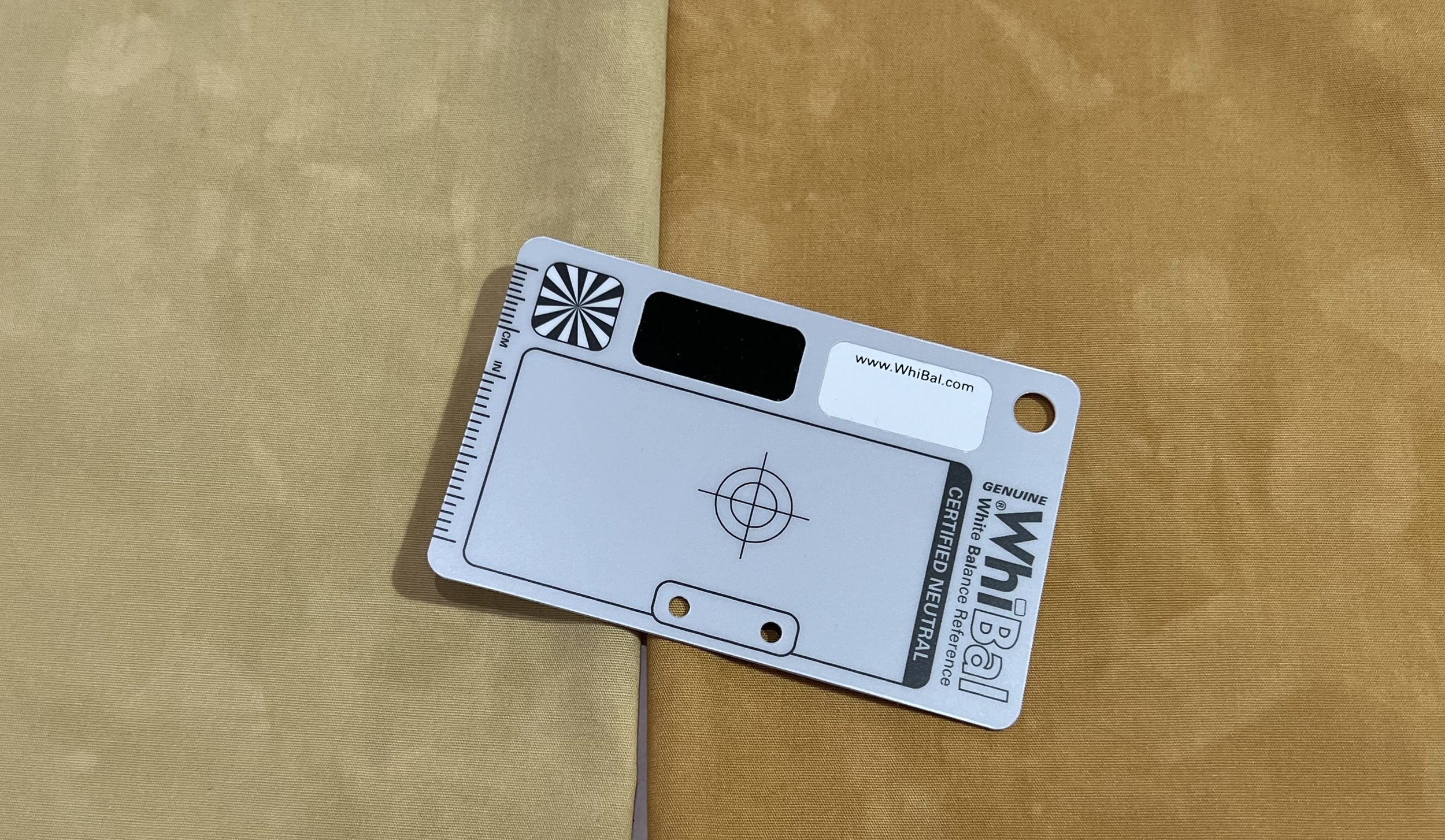
The image below shows a sample dyed using the formula for the swatch label 431 on the swatch page. The quantities of yellow, red, and blue dye were altered using the adjustment factors. The test swatch is a little blotchy and the match isn’t 100% perfect, but I’m satisfied.

If there was any doubt that the adjustments were making a difference, I dyed another swatch using the same formula but with no adjustment. In the image below the lighter swatch was produced by the unadjusted formula. Remember, both swatches were dyed using the same older dye powder. The only difference is smart adjustment.
Lessons for the future (and things you might consider doing)
I’ve learned a few valuable lessons from this little exercise:
While this isn’t a lesson for myself per se, it is a critical element to consider. You’re going to have very limited success with this approach if you are measuring your dye by volume (e.g., teaspoons). Consistent results require that you work with dye in solution of a known concentration and measure in milliliters. I generally mix my dye at 5%, which means 5 grams of dye powder added to 100 ml of water, (plus about a tablespoon of urea). Dye powder is mixed at the factory with of ingredients referred to as diluents, which are intended to adjust the overall weight of the dye powder to produce a consistent result. It’s about weight not volume.
As much as I love my sample book, what would have been most useful in evaluating the difference between old and new dye was a set of baseline swatches dyed at the time I purchased the dye. So, if I’d dyed a 6- or 8-step gradation using progressive dilution (e.g., 10% OWG, 5%, 2.5%, etc.) when my dye was fresh then done the same thing when it was older I could have compared the two and possibly gotten a more accurate adjustment factor with less fuss. It’s definitely worth taking the time to do this kind of swatching on new dye if you don’t plan on using it all within six months.
Let’s end with a pretty picture
The gradations below are fat quarters dyed with 5-year old dye powder and I’m delighted with the result!
Hey kids, pay attention to your math and science teachers. That stuff might come in handy, even if you grow up to be an artist.

Thoughts about the Mindful Scribbling series

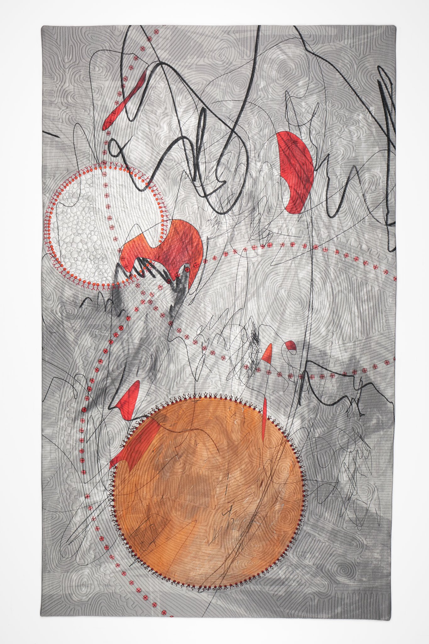
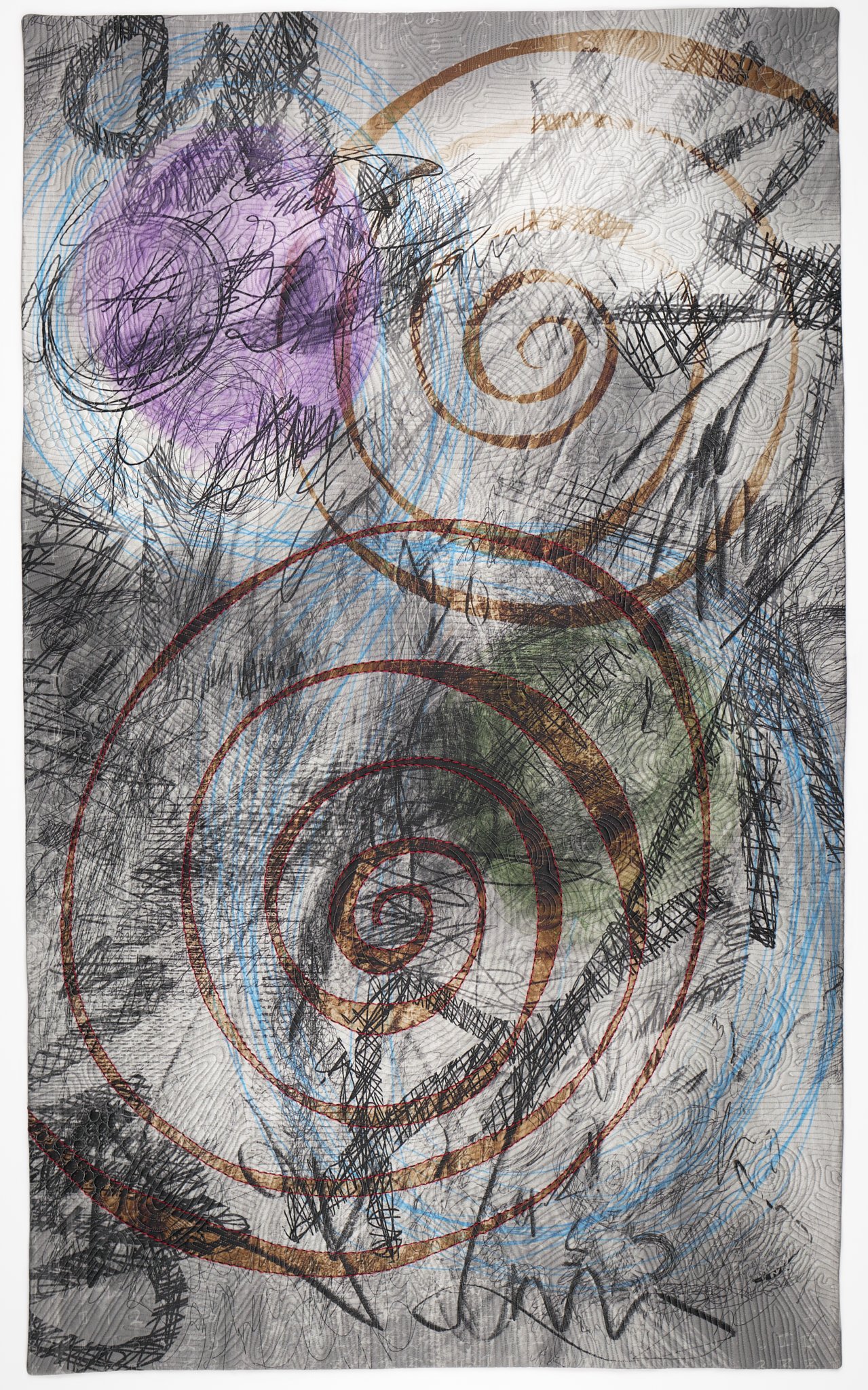
Mindful Scribbling #1. 2022
I’ve written before in numerous places about the advantages of creating artwork in a series: developing ideas, refining technique, seeing how thoughts evolve over time to name a few. Artwork, and series work in particular, can also be a way of processing experiences and emotions in a way that writing, talk therapy, and other verbal exercises might not. The Mindful Scribbling series is an example of all of these things.
I think that artwork should stand on its own without copious explanation of what it’s about. It’s either compositionally strong and engaging or it’s not. Explanation can enhance understanding, but shouldn’t be the reason for deeming a piece to be outstanding. I think that the work in this series is strong in its own right, but it also merits a deeper discussion of the backstory, at least in this particular case. So, here goes.
The backstory
At the time of this writing I believe that it’s safe to say that the reader recalls, from their own lived experience, the spring of 2020. People in the US and many other countries were living in government mandated isolation in their homes, hoping to arrest the spread of COVID-19, all the while watching terrifying reports of overrun hospitals and morgues on TV. “Lockdown,” as it came to be known, seemed to help and hurt in equal measure. Children, older folks, and people living alone suffered from social isolation. It was even a bit much for introverts like myself. Patients in hospitals were separated from their family members in an attempt to protect both medical staff and patients from visitors who might be carrying the virus. This exact scenario was one of my worst fears—that I or my husband would be hospitalized, separated, and unable to help each other. That’s just what happened, but not in the way that I feared.
TRIGGER WARNING: The following paragraph deals with a car crash and the ensuing hospitalization. If those are things you’d rather not read about then skip the section within the red horizontal lines.
On June 2, 2020 my husband, Dan, was on his way to play a round of golf—a safe, masked, socially distanced, outdoor activity. Along the way his car was struck broadside by another car. Dan’s car was the third car entering an intersection after the light turned green. The driver of the other car ran the opposing red light at 95 MPH. Dan lived, but only barely, He was cut out of the car, intubated at the scene because he wasn’t breathing but somehow did have a pulse, and taken to a level-one trauma center. He had a closed head traumatic brain injury, broken bones (ribs, vertebrae, shoulder, sternum, and knee), collapsed lungs, cardiac trauma, and he was on a ventilator. I learned all of this over the phone because I wasn’t allowed to enter the hospital, much less visit him. His first ICU doctor arranged for me to visit, with the expectation that I was most likely coming to say goodbye. I don’t know why or how she managed this, but I came to understand that it was way outside the norm. It was a horrible experience but one for which I will always be grateful. Dan came home on 10 weeks later on Aug 12 after several trips to the OR, 3 weeks in ICU, time in a “skilled” nursing facility, and almost a month at National Rehabilitation Hospital (Medstar NRH). With the exception of the almost-deathbed visit and a surprise encounter in July when I happened to see him being loaded into a medical transport van on the way to NRH, we were completely separated. He remembers nothing of the entire month of June and July is a bit fuzzy, which says a lot about the nature of brain injuries. I remember everything. By mid-July he had recovered enough to manage phone calls and FaceTime. He spent a year in outpatient PT and OT, with speech/language therapy and vision therapy and another surgery thrown in. It was our whole lives. Obviously we wish it never happened, but we owe everything to the doctors, therapists, friends, family, and colleagues who helped put Dan’s body and our lives back together. “Back together” doesn’t mean “the same as it was.” He can walk, talk, see, think and care for himself—things I was told were possible, but not guaranteed. He went back to work and is as smart and capable as the sharpest person in most rooms. Neither of us takes these things for granted.
If you can believe it, that’s the short version of what I did during COVID isolation. There was no art-making. I’m a self-employed, full time artist, and my income isn’t the one keeping our household running. That meant that I could walk away from the studio and give everything to managing Dan’s care and the frightening and confusing bureaucratic mess we’d landed in. There were calls to insurance adjusters, our lawyer (to deal with the insurance), doctors, therapists, and the assistant state’s attorney and the investigating officer (to deal with the prosecution of the guy driving the car that hit Dan). There was communication to manage—family, friends, and colleagues across three continents. And, as I said, there was no art-making.
Returning to the studio
I did try to draw a little while Dan was away. I picked up my iPad and the most that I was able to manage was a series of angry scribbles in black and white. I’m grateful for the moment of clarity when I said to myself, “Don’t do this now. It’s not the time. You’ll find your way back, but not today and not for a while.” So, I focussed on the big problems and left the studio—literally and figuratively—to collect dust.
When I did get back to work, late in the winter after the accident, we were still dealing with a full therapy schedule (3-5 days per week). I did things like clean out the studio storage closet and organize shelves. That activity prompted the ongoing Reformation series, which you can read about on the Reformation Overview page. Eventually I looked at those scribbles and began to wonder what would happen if I spent a little time with them. I didn’t intend it as any sort of art therapy, but I saw something spontaneous and interesting in the marks that seemed to warrant further consideration. Over time those scribbled drawings evolved to become the Mindful Scribblings series, a group of six quilted paintings that I never intended to make, but which happened none the less.


Some general observations
Size and materials
All of the pieces in this series measure 31 inches wide by 52 inches tall. They are whole cloth paintings created on an iPad using Procreate. The finished compositions were printed on cotton sateen by Spoonflower (spoonflower.com). Each was layered with acrylic felt batting and a muslin backing, then free motion quilted. Numbers 1, 3, 4 and 5 include hand embroidered details that I added prior to quilting. Numbers 1 and 2 includes 12 machine embroidered motifs in total. I designed all of these elements using either drawing software or programs that I wrote myself. All of the resulting designs were then stitched out using an embroidery attachment on my sewing machine.
Change over time
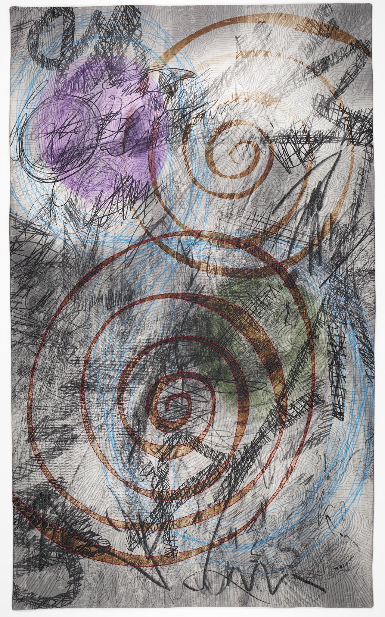
There are six pieces in the Mindful Scribblings series. Similar to the pieces in the Outward Movement series, the pieces are numbered in chronological order and I can see change over time. The earliest pieces, #1 in particular, are largely monochromatic or have a very limited palette, while the later ones are more colorful and lively. They all have a doodle quality, which becomes more complicated as you move though the series.
The final piece, #6 is definitely part of the series. It has the same scribbling quality and, while the palette is broader than the early pieces, it is still limited. The spiral forms speak to the doodle quality of the other pieces and to the circular forms seen in all of the pieces, except possibly #4—though I would argue that the three colored shapes along the midline of #4 could be interpreted as imperfect circles. Two things that are particularly interesting about #6 are that it references motifs found in some of my other work (circular and spiral shapes, and large shapes that dominate the canvas, as compared to the smaller, tighter shapes in the other pieces in the series). I interpret this as an indication that I was beginning to reconnect with my pre-crash body of work, and that’s why I feel that #6 brought this series to a close.

The nature of doodles
Whether it’s doodling in the margins of a notebook during a meeting or intentionally playing with doodles in a sketchpad, these unplanned marks can be revealing. In some cases they might speak to one’s state of mind at the time they’re drawn. In others they might open the way to discovering new marks, glyphs, or motifs, which could be incorporated into future designs.
There are certainly things that I draw when my pen is aimlessly occupying itself on a page: counting-style hash marks (e.g., 4 vertical lines and an overlapping diagonal line to represent 5) grids, isometric cubes, meandering lines with filled shapes, and more. I don’t really know if any of these things mean anything, though I will confess that when I’m stressed I often find that I count (silently, to myself), so perhaps the hash marks are an extension of that. I’m less concerned about the meaning and more about graphic quality of these marks and the feeling that they carry an authenticity. They aren’t something that I invented for the purpose of including them in a design. (In a couple of paragraphs I’m going to say something that contradicts that statement, but stay with me for now.)
So, the doodles showed up to some extend in the original drawings. For this series I had those drawings printed on cloth by spoonflower.com then added elements to the design through hand and machine embroidery before quilting. The hand embroidery is generally intended to reinforce existing forms in the composition. However, in the case of #3, new circular shapes were introduced. Hand stitching is show, laborious, something a little painful (hand cramps and sore fingers), but also meditative.


Machine Embroidery
My doodling takes another form as well. I’m not sure what to call it except possibly code doodling. I’ve been doing some form of computer programming since the last 70s. You might say that its a left brain logical activity that balances out my right brain creativity, or perhaps its another expression of the right brain stuff. Either way, it’s something that I enjoy doing. Sometimes I get an idea and think, “Hmm, I could do that by hand, but wouldn’t it be interesting to do it with a computer and try loads of different variations.” Those code doodles have often made their way into my artwork as graphic elements in a design that’s printed on cloth (again, by spoonflower.com). In recent years I’ve figured out how to turn iPad drawings and mathematically-derived patterns/shapes into files that will drive the embroidery module on my sewing machine.
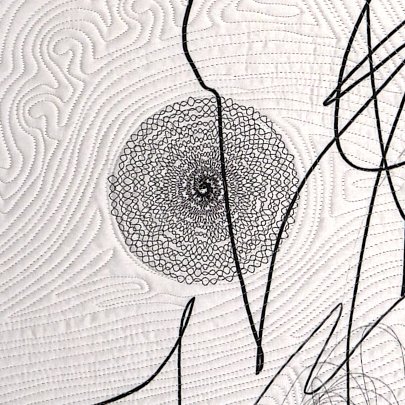
The collection of detail images below shows some of these machine-embroidered elements found in #1 and #2. While this isn’t meditative in th way that hand stitching is, there is still a mindfulness involved in the entire process.


Quilting lines
I’ve always said that I look at quilting as the last layer of drawing added to a quilted composition. In the case of this series the quilting lines, while still entirely improvisational, are very much intended to both reinforce and extend the design elements. As seen in the detail image below, the circular quilted elements in the open white background of #1 are a good illustration of this idea of compositional elements represented solely by quilting lines. Other quilting lines reinforce lines of flow or help provide definition for other quilted elements. For example, the straight lines in the upper right corner help give definition to the large quilted circle and create an, albeit subtle, figure-ground distinction.

Mindful Scribbling #1, detail
Things we’re afraid to say out loud
I haven’t addressed the embroidered block of odd patterns in #2. That deserves attention, if only to save the explanation here for posterity. But, I’ve intentionally saved it for near the end.
There are things that we say to each other—superficial greetings or observations about the weather. There are deeper things too. There’s also that old rule about not talking about sex, religion, and politics in “mixed company,” at the dinner table, and so on. Personally, I think those are some of the most interesting conversations. But—there are some things that we might want to say but feel hesitant to say them at more than a whisper. Those might be things like, “Mom, I’m gay,” or “I love you”, or “I’m disappointed in you right now,” or “I’m scared.”
For years I’ve been fascinated by the way that encryption and obfuscation can be used to speak a secret and keep it hidden at the same time. That’s what those pattern in #2 are: graphically encrypted text. I wrote a Python program to run text through a complex substitution cipher, converting the letters into numbers and representing those numbers with as symbols. The results get written to a file that’s compatible with the embroidery module on my sewing machine. I won’t bother you with the logic of the encryption, but I will come clean on what the blocks of text say.
On June 2, 2020, against all odds, he became The Boy Who Lived.
Forever altered, we both survived.
Is life just a never-ending cycle of trying to stand, getting knocked down, and getting back up again?"
So, now what?
Do we just wait?
How do I stop holding my breath?
Final thoughts
This spring (June 2024) will mark 4 years since Dan’s car accident. The Mindful Scribbling series—the one that I never intended to make—has come to a natural conclusion. There are no new series that directly address the experiences of 2020-2021. I’ve written about all of that and, while Dan, our friends, our family, and I will never forget those events, I don’t think that the story needs more telling or that more art needs to flow from those experiences. Having said that, it’s worth noting that everything we are and do stands on the foundation of all of our prior living and learning. It will always be there in some way; to deny it would be foolish, but to be trapped in those memories would be wasteful.
Timeline and history
| Title | Date | History |
|---|---|---|
| Mindful Scribbling #1 | 2022 |
Juried into "Quilt National 2023" Published in "Quilt National 2023" exhibition catalog Exhibition: "Quilt National 2023," Dairy Barn Art Center, Athens, OH, May 26 - Sept 11, 2023 Exhibition: "Quilt National 2023," Holter Museum of Art, Helena, MT, Oct 26, 2023 - Jan 1, 2024 |
| Mindful Scribbling #2 | 2022 |
Juried into "Quilts=Art=Quilts 2022" Exhibition: "Quilts=Art-Quilts 2022," Schweinfurth Art Center, Auburn, NY, Oct 29, 2022 - Jan 8, 2023 |
| Mindful Scribbling #3 | 2023 | |
| Mindful Scribbling #4 | 2022 |
Exhibition: "Between the Lines, (Gayle Friedman & Russ Little)," Portico Gallery, Brentwood, MD Nov 19, 2022 - Jan 14, 2023 |
| Mindful Scribbling #5 | 2023 | |
| Mindful Scribbling #6 | 2023 |
Anticipating good stuff in 2024

Yep, that’s a real live dumpster fire in Albuquerque, NM in May 2022.
While I know that we all need to strive to live in the present, I can’t help thinking a bit—well more than a bit—about the future. Are you, like me, already holding your breath and grinding your teeth about just how very likely it is that 2024 is going to be a total shit show? Sorry, but there’s just no better term. “Dumpster fire” just doesn’t seem to be adequate, though I do have an illustration for that one.
I’ve been trying to think of some good things that I can look forward to in the coming year. This is my list. It’s far from comprehensive. It doesn’t even touch on theatre, and it certainly doesn’t represent the breadth of genres within the categories I’ve chosen to highlight here. Take a few minutes to think of your own good stuff to come.
Books
Moonbound
Robin Sloan
A new novel from the author of Mr. Penumbra’s 24-hour Bookstore. I’m counting down the days to this one.
June 11, 2024 (amazon.com)
The Life Impossible
Matt Haig
I really enjoyed The Midnight Library so I’ll be interested to at least try a sample of this one.
Sept 3, 2024 (amazon.com)
The Book of Love: A Novel
Kelly Link
The is the first novel by a well regarded short story author, and firsts can be really outstanding.
Feb 13, 2024 (amazon.com)
Somewhere Beyond the Sea
T.J. Klune
A sequal to The House in the Cerulean Sea. The first book was amazing.
Sept 10, 2024 (amazon.com)
The Demon of Unrest: A Saga of Hubris, Heartbreak, and Heroism at the Dawn of the Civil War
Erik Larson
Promises to be a very timely read as it deals with the deep division in the nation following Lincoln’s election. Gosh. Sound familiar?
April 30, 2024 (amazon.com)
The House of Hidden Meanings: A Memoir
RuPaul
This one should be an excellent listen. In the same vein, I recommend listening the autobiographies by Billy Porter and Harvey Fierstein.
March 5, 2024 (amazon.com)
You Like it Darker
Stephen King
A new collection of short stories just in time for summer reading
May 21, 2024 (amazon.com)
The Black Bird Oracle
Deborah Harkness
A fifth book in the All Souls Series, which began with A Discovery of Witches (did you see what I did there (“It begins with…”)? I had no idea a fifth book was in the works, so this will definitely make the summer a little brighter/darker.
July 16, 2024 (amazon.com)
Heartstopper #6: A Graphic Novel
Alice Oseman
I realize that I’m over 60 and not exactly the target audience, but don’t even attempt to give me grief about reading this series. It’s adorable and sweet. The author previously said that #5 would be the last, so hooray for #6.
Sometime in 2024 I hope
Music
Bleachers a new album from Bleachers schedule to be released on March 8, 2024. Two singles have already been released. https://www.bleachersmusic.com
The Saviors, Green Day, Jan 2024. https://music.apple.com/us/album/saviors/1711049681
Art
Subversive, Skilled, Sublime: Fiber Art by Women
Renwick Gallery, Smithsonian American Art Museum, Washington, DC
Opening May 31, 2024
https://americanart.si.edu/exhibitions/fiber-art-by-women
Woven Histories: Textiles and Modern Abstraction
National Gallery of Art, Washington, DC, East Building, Concourse Galleries
Opening March 17, 2024
https://www.nga.gov/exhibitions/2024/woven-histories-textiles-modern-abstraction.html
Multiplicity Blackness in Contemporary American Collage
Phillips Collection, Washington, DC
Opening July 6, 2024
https://www.phillipscollection.org/event/2024-07-06-multiplicity
Whitney Biennial 2024: Even Better Than the Real Thing
The Whitney Museum, New York, NY
Opening March 2024
https://whitney.org/exhibitions/2024-biennial
Thoughts about the Outward Movement series

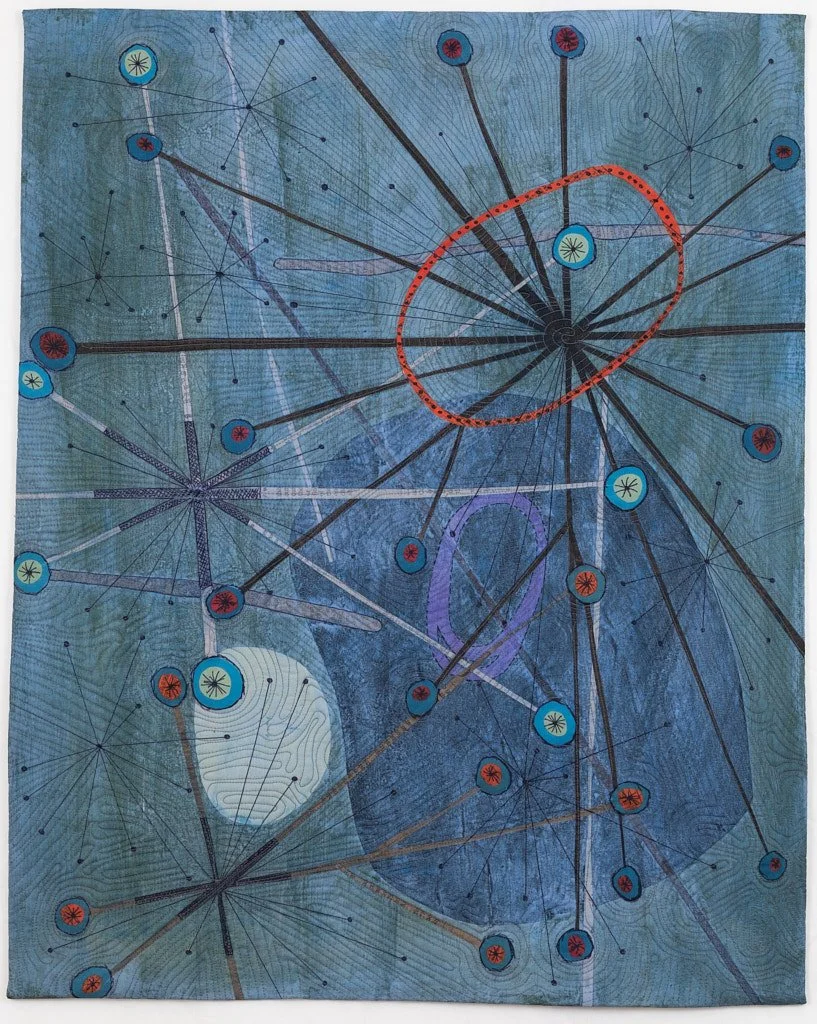
Outward Movement #1. 2018
Most of my artwork is created in a group or series of pieces that are related by content, purpose, or method. Working this way allows me to explore an idea over time and to refine my thinking. That isn’t to say that the earlier works in a series are somehow less than the later works, but looking at the group as a whole often reveals an evolution of thought. Sometimes I don’t even see that pattern of change myself until I’m well into the series or until I sit down to think and write critically about what I’m doing—like now.
I’m grateful to have completed several series, and to have several more still ongoing. The “completion” of a series is less a matter of reaching a predetermined goal of a number of pieces and much more about intuitively knowing that I have reached a point of completion. When the thought is complete, the mental itch has been adequately scratched, or I feel that the next piece is going to be forced simply for the sake of making “just one more” then it’s time to move on. I’ve recently decided that Outward Movement is finished, so this is a good time to capture my thoughts about this body of work. I’m hoping to do the same for my other completed series in the future.
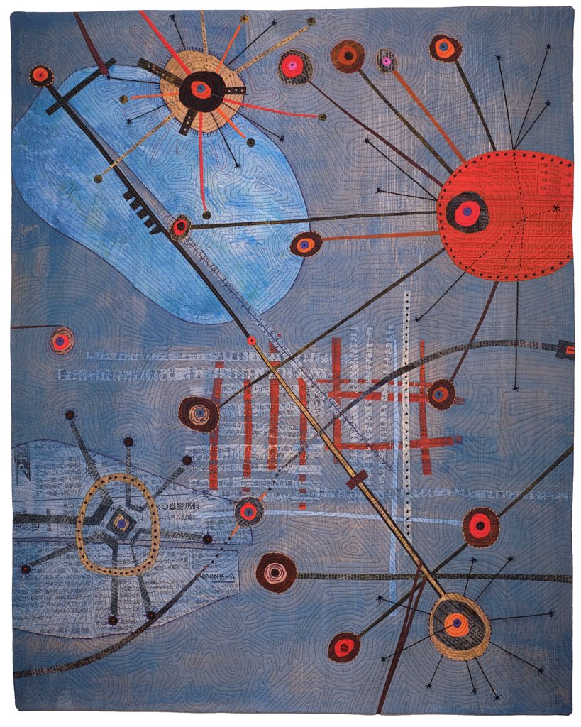


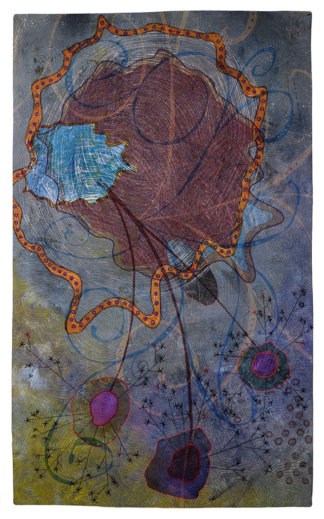
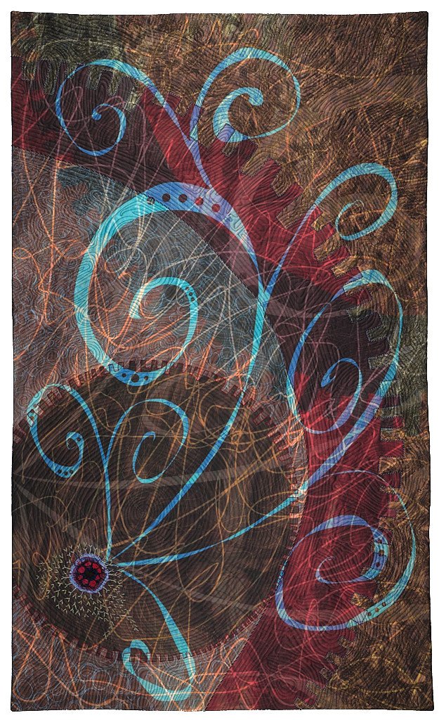
Two subgroups
The seven pieces in the Outward Movement series were completed between 2018 and 2022. There are two distinct groups within the series:
The earlier, smaller pieces (1-3) measuring about 26 x 33 inches and the later pieces (4-7) measuring about 31 x 52 inches.
The first group all began their compositional lives as painting with collage elements on hardboard, while the second group are entirely digital compositions created on an iPad.
Why and how size might matter
Why the size change in the middle of the series? Gosh there are so many bad jokes to be made here about comparing size, but it really came down to a conversation that I had with a juror at an opening reception. She said something like, “I really like your piece, but it needs to be larger. It needs a ‘gallery presence’ that draws people to it from across the room.” Textile works of this sort— so called art quilts—tend to be large pieces. We’re talking in the range of 80 x 80 inches. That’s big, hard to store, difficult to ship, and when it comes to pricing they’re also much more expensive than smaller work. Also, show of hands, who has an empty wall in their house that doesn’t get direct sunlight, and can accommodate something that size? And yet, looking around that gallery I could see her point: my artwork looked out of scale, dwarfed by more monumental work. And thus, the size of 4-7 is both wider and taller but still within a size that could fit into someone’s home. I’ve now seen these larger-sized works in similar settings to that first show and I think that, while not being monumental themselves, they hold their place in the room better. Having said all of that I will observe that 1-3, the smaller pieces, have all been sold. So, do I size my artwork for the home or the gallery? It’s an open question, the answer to which I think might be to make some of each.
The ways I work
The first group is also different from the other in that these three pieces represent a combination of computer and manual techniques, and they all have a strong visual look that captures the hand drawing and painting, as seen below. I created 16 x 20 inch painted backgrounds on hardboard. On top of these I added painted paper shapes and lines and hand drawn elements to create the final composition, and these paintings exist as artworks undo themselves. Each finished painting was photographed, then the images were color corrected and printed on cloth using a wide carriage inkjet printer (by spoonflower.com). The printed fabric was stacked with acrylic felt batting and muslin backing then machine quilted.

Outward Movement #2

Outward Movement #3
Numbers 4 through 7 were created as paintings on an iPad using the Procreate app, which allows me to create layered drawings with shapes, fills, and a wide variety of line and brush marks using a stylus. These were among my first digital compositions. Number 4 is an all digital composition, but the highly textural background is derived from a photograph of a gelli plate monotype print with additional relief printed elements. With Procreate I was able to manipulate the image and add line and shape elements. By contrast, #7 is entirely digital. All of the background and foreground elements are created entirely in Procreate.

Outward Movement #4

Outward Movement #7
Hand stitching
Many of my pieces include some element of stitch beyond the obvious quilting lines. Sometimes the added stitch is created using an embroidery machine and other times by hand. In all cases the intent is to add detail and emphasize elements. On another more subtle level I also intend it to play off of, and contrast with, the regularity and sharpness that can come from computer-printing. The printer creates a far sharper line than I would by hand; the subtle or not-so-subtle irregularity of hand stitching can soften that sharpness.

Hand stitched details on Outward Movement #7
Quilting lines
For many years I’ve said that quilting lines are the final drawing element that I add to a quilted textile composition; it continues to be true. I quilt on a sit down long arm quilting machine. That means that the machine remains stationary while I move the quilt around freely under the needle. There are no feed dogs to move or guide the fabric. The quilting patterns are spontaneous. The only planning that goes into what I quilt is when I periodically stop, put the quilt on the design wall, and think about what might come next. There’s never any marking, templates, or rulers. The image below is a good example of much of my quilting. The quilting lines are reactions to the graphic elements, following the lines of the composition, but they also create new shapes that echo, emphasize, or stand in juxtaposition to the graphic elements and each other. The quilting lines are also an exercise in drawing with shadow. When the finished artwork is hung on a wall and lit from above, the texture created by the quilting catches the light, casting tiny shadows and bringing the surface to life.

Hand stitching and machine quilting lines on Outward Movement #6
Symbols and meaning
Circles
When I look at all 7 pieces in the series it is undeniable that circular forms are a key element. We all have shapes that speak to us. From some folks it’s squares; for others triangles. For me it’s circles, and they find their way in to most of my work in varying sizes.
The circle symbolizes a completed cycle, a center, wholeness, softness, enclosure,—perhaps even an embrace or protection.
Lines and paths
Lines can do several things in a composition: divide space, demarcate shapes, create connections, and establish flow. It’s impossible not to notice that the earlier pieces in the series emphasized straight lines, while the later pieces use many more curved lines. The curved lines more your eye through the piece differently than the straight lines. They also give the later pieces a more organic feel. The curling and branching lines feel vine-like, but also playful. Drawing these element felt like a playful act, and I think that feeling is instilled in the result.
Juxtaposition of angles and curves
Angular lines and sinuous lines are interesting on there own. Straight lines and sharp angles can evoke a feeling of the built environment, while curved one might feel more organic. Incorporating both angular and curving lines into the same composition can be an interesting way to depict the interaction between these two things—the built world and the natural. This is a recurring theme in my artwork and a design motif I use often.
Relative scale
Looking at the series in chronological order, I find it interesting that the circular elements become fewer and grow larger. In #7, about one third of the large gear-like circle covers most of the design space. I see this shift in scale as an opening up of the circle. As the circles get larger they begin to move more and more out of the design space. This feels like a natural expansion, like opening my arms from a tightly crossed posture. This expansion and outward movement wasn’t planned, and was only apparent to me after the later pieces were finished. And so, having grown the design elements right off the page, it feels that I’ve arrived at a fitting end point for the series.
Portfolio links
Timeline and history
| Title | Date | History |
|---|---|---|
| Outward movement #1 | 2018 |
Quilt National 2019, Dairy Barn Art Center, Athens, OH, May 25 – Sept 2, 2019 Quilt National 2019, Foundry Art Center, Saint Charles, MO, Oct 4 - Dec 6, 2019 Published in Quilt Naitonal 2019: The Best of Contemporary Quilts Sold in 2019 |
| Outward Movement #2 | 2019 |
Quilts=Art=Quilts 2019 Sold in 2019 |
| Outward Movement #3 | 2019 | Sold in 2021 |
| Outward Movement #4 | 2020 | Between the Lines, (Gayle Friedman & Russ Little) Portico Gallery, Brentwood, MD Nov 19, 2022 - Jan 14, 2023 |
| Outward Movement #5 | 2020 |
Published in Wide Open: An Exhibition by the Art Cloth Network Open Space, Cultural Activities Center, Temple, Texas, Nov - Dec, 2021 (a combined showing of ACN The Space Between and Wide Open) Open Space, Austin Bergstrom International Airport, Austin Texas, Zilker and Jollyville Galleries January - May, 2022 (a combined showing of ACN The Space Between and Wide Open) Between the Lines, (Gayle Friedman & Russ Little) Portico Gallery, Brentwood, MD Nov 19, 2022 - Jan 14, 2023 Wide Open, Bloomingdale Parks District Museum, Bloomingdale, IL June 8 - Aug 5, 2023 |
| Outward Movement #6 | 2020 |
Between the Lines, (Gayle Friedman & Russ Little) Portico Gallery, Brentwood, MD Nov 19, 2022 - Jan 14, 2023 |
| Outward Movement #7 | 2022 |
Between the Lines, (Gayle Friedman & Russ Little) Portico Gallery, Brentwood, MD Nov 19, 2022 - Jan 14, 2023 |
The bubbles that didn't burst
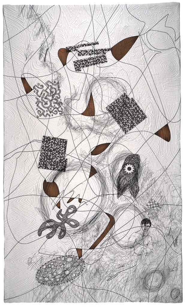
Mindful Scribbling #2
I have fantastic news, but first let me ask you this: How do you react to good news--not about others, but about yourself? Good news about others is easy; I'm all whooping and congratulating. I seem often to meet good news about myself with shock and disbelief. It's like my brain just turns off for a few seconds, sort of the way the cable box reboots after a momentary power outage.
That's what happened this morning when I got the email notification that my artwork was selected by the jury to be included in Quilt National 2023. First it was shock, then disbelief, then re-reading the email THREE times to make certain it said "Congratulations" and not "Regrets", and finally walking upstairs to find Dan to say in a small voice, "I got in." I had a similar reaction last month when I got the notice that another piece in the same series (Mindful Scribbling) was accepted into Quilts=Art=Quilts 2022. These two art quilt shows are easily among the most sought after in North America, and I’d venture to say, given the international draw of applicants, the world. It’s a thrill and and honor to be included in either, not to mention both.
As I write about this I'm realizing that part of my shock comes from the magnitude of the thing, but another part comes from the hope that I’ve carried in my heart in the months since I submitted my applications. It’s always the same; I mark the expected announcement date on the calendar (the way a group facilitator uses a flip chart “parking lot”) to get the idea out my head so I can move on to the next thing while the jurors or curator do their work.
That hope seems like a soap bubble—so fragile that a sideways glance or a breeze will pop it. This time my bubble (bubbleS!) didn’t burst. But, they certainly have in the past, and they will again in the future. It’s the nature of subjective work. I alway give myself some version of the same pep talk when I don’t make the cut. “The jury was looking for something else.” “It’s not a condemnation; it’s one show.” But there’s alway the other voice—and it’s a loud one—”Why NOT me?” and “What did I do wrong?”. It’s the dark side of seeking public exhibition of your artwork. Sometimes the answer is “No”.
And so, to all who have received shockingly good news about a personal achievement, I hope that you can close you eyes for a moment and feel all of the good feelings. For those dealing with a disappointment, I know from personal experience—which I will have again—that disappointment comes from an unfulfilled hope, and that deserves a bit of grieving. This feels like a dark moment, but you are not alone.
May the road ahead be filled with a healthy balance of success and disappointment, each giving us perspective and appreciation for the other.
Restocking after a big weekend

Many thanks to everyone who has taken advantage of the deep discounts in my online store and to those those who turned out for our first-ever wearable art garage sale. My goal was to reduce inventory, and we’ve definitely done that! I’ve just added more items to the online store (https://russlittlefiberartist.com/shop-wearable-art), but this will most likely be the last addition this year.
The 50% sale is still running. All wearable art in the store is marked with its discounted price. Unlike last week, there’s no need to enter a discount code during checkout to get the sale prices.
Items usually ship within 24 hours of your order. However, due to holiday travel, we won’t be shipping on Thurs, 11/25 or Friday 11/26.
Happy Thanksgiving everyone. I’ve got quite a few things for which to be thankful, not least of which is this really successful sale.
50% off sale
Yes, you really did read that correctly. I’m having a huge sale to reduce my inventory of one-of-a-kind wearable art scarves.
After 10+ years of making and selling wearable art scarves I’m shifting the focus of my studio art practice to emphasize fine art textile. This isn’t a snap decision; I’ve been gradually moving toward this for awhile now. But, I will say that the upheaval caused by the pandemic and the things that Dan and I have been through these past 18 months have brought into clear focus just how precious time and opportunity are. I feel strongly that my path has shifted and I need to follow where it leads.
I’ve found joy and fulfillment in creating artwork that my clients have worn and enjoyed—things that have made them (you) feel even more attractive and confident. My studio practice has always been about creating fine art. Wearable art was an offshoot of that. My goal now is to simplify and go deeper.
Now for the fun part. As the flyer below describes, I’ll be hosting an in person sale this Saturday (Nov 20) in the garage at our house in College Park, 1:00 - 4:00 PM. Every wearable art scarf will be on sale for 50% off the marked price.
If you can’t make it in person, everything wearable in my online store is also 50% off starting right now. You can shop the online store at https://russlittlefiberartist.com/shop-wearable-art.
Hope to see you on Saturday for this rare opportunity.

The making of Reformation #1 - #9
If you haven’t already done so, take a few moments now to read the preceding post titled Reformation: A new artwork series because it sets the stage for what will follow.
The Reformation series is about trying to let go of things and ideas from the past and allow them to become something new—at least that’s my current thinking. As I was developing the first works of art in this series, I gradually began to see the the whole thing as a metaphor for letting go of—or at least holding loosely to—long held ideas about what is/was most valuable from the past and about how the future would play out. Events in my life and in the life of the world this past year have altered my perception of both past and future. The future that I think about today is different from the one I contemplated a year or two ago. Perhaps I can allow the past and present to inform the future and let it be what it will be (cue strains of Que Sera Sera).
The first 9 pieces in the Reformation series began by cutting up the three finished art quilts pictured below. These selections weren’t trivial. All of the pieces have been publicly exhibited, and the two pieces from Restructured Circles are part of the largest cohesive body of work that I’ve created to date. The first cut was a breathless moment, but once I started there was no going back.


What came next was step-by-step, largely unplanned combination and transformation of the pieces that I cut from the finished quilts. I wish that I’d taken more process pictures, but I say that at the end of every project. I worked hard to keep the process as loose as possible, and I allowed myself the freedom to do anything to the pieces at any point. I painted and printed over the fabric to add visual texture and shift the hue and value, lightening some pieces and darkening others. I fused fabric to add new elements and machine couched yarn to add linear elements. I also cut, sewed, cut again. Because I was working with dense, thick material (the quilted fabric was make up of a top layer plus batting and backing) I assembled the new quilt by butting cleanly cut edges together and zig-zagging over them.
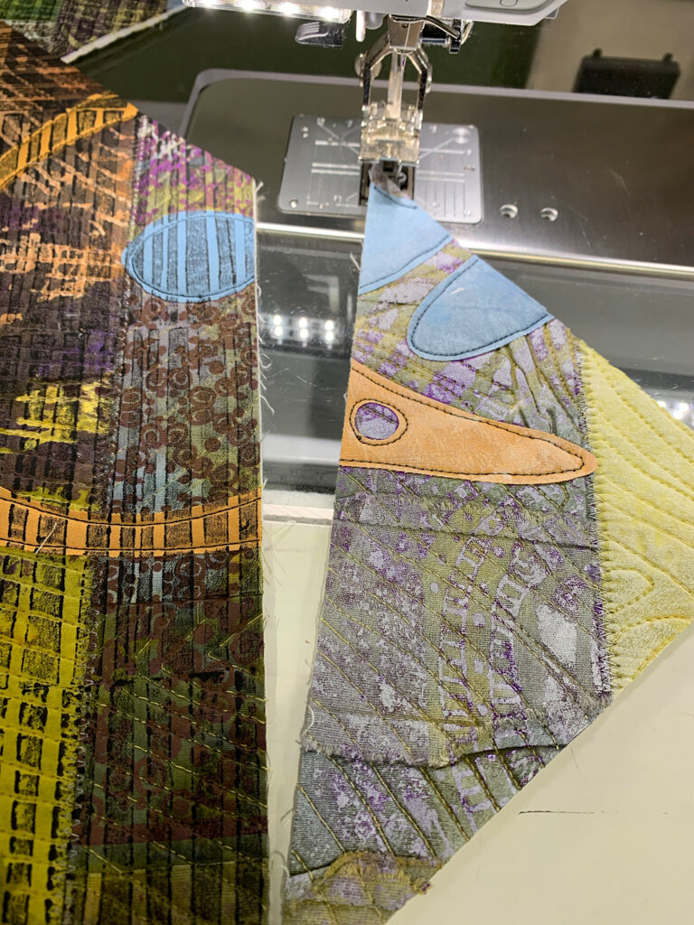
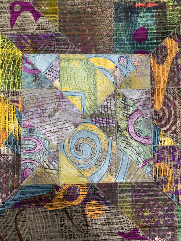
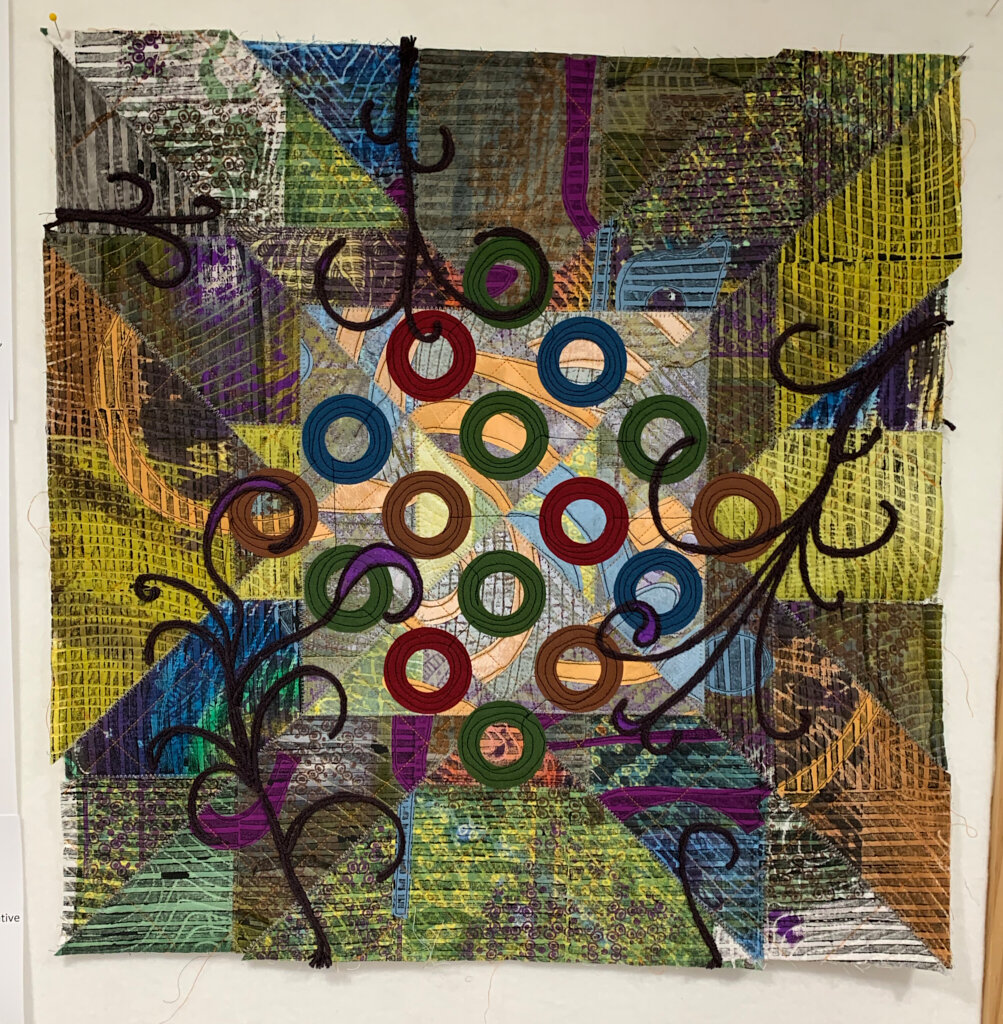
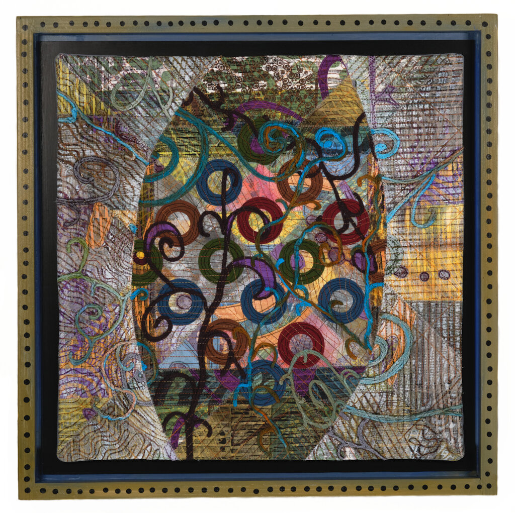
And, if that wasn’t enough, all of the pieces (or at least these first 9!) are in original hand painted float frames or mounted on similarly painted cradle boards—all my own design and construction. The overall framed dimensions are 20 x 20 inches. The question is, did I really need to make the frames myself and did I have to make the process so complicated? Well, it undeniably cost less than paying a framer, but it quickly became more work than I’d intended. I began the frames with the plan of painting them all solid black. As I was doing the carpentry work I started thinking about how much I like painted and embellished folk art frames and how such a treatment might speak to the outsider quality of artwork. And so the hand painting happened.
So, here they are, the first 9 pieces of Reformation, each in its own custom frame.
Visit the Reformation section of my portfolio for more detail shots and information about each piece. Yes, they are for sale, but I haven’t had the time to add them to my online store. Feel free to email me if you’re interested (russ@russlittlefiberartist.com). They’re all $500.


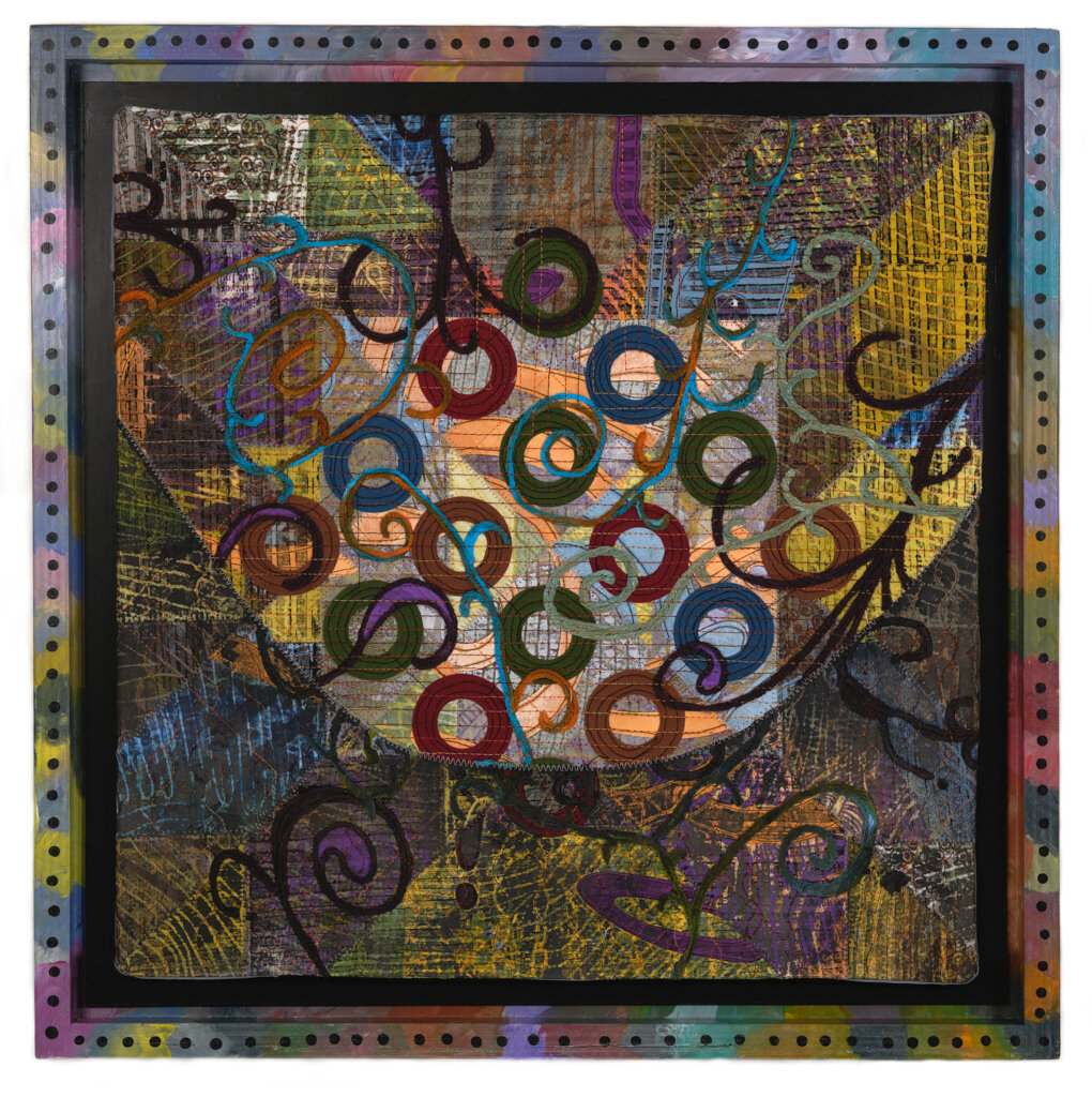


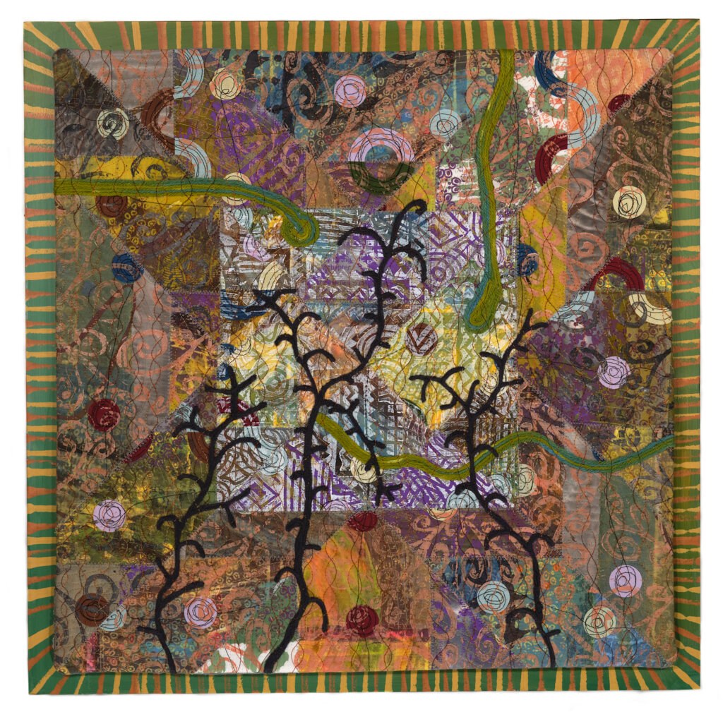

Reformation: A new artwork series

Reformation #1
If you’ve been following my life through Facebook this past year you likely know that, in addition to the generalized concerns about politics and pandemic, my husband Dan and I have been dealing with the aftermath of his nearly fatal car accident on June 2, 2020. If that news escaped you and you want to learn more of our story you can refer to Dan’s Caring Bridge site that I started last summer (https://www.caringbridge.org/visit/danryancollegepark). Stated simply, my priorities shifted during the months Dan was hospitalized and the months of PT, OT, and several more “T”s that followed. The studio was abandoned and I did no art work.
In mid-winter I began tinkering a bit in the studio, trying to work in a bit of art time around a very full schedule of medical and therapy appointments. But, it wasn’t until April that Dan’s recovery had progressed to a point where I was able to begin to venture back to the studio in any serious way. Once there I found myself lacking in every way. I had no stamina, concentration, or inspiration, so I did what I usually do in such situations: I cleaned, put away, organized and rearranged.
In the midst of the cleaning I attacked the storage closed that holds all of my complete work. As I unrolled quilts to give them a good airing out I began thinking about the future of some of the older work. Some hadn’t been exhibited, but some had. Obviously, none of it had sold. Was it going to? Did I want to hang any of it? What if something happened to me; would anybody want this stuff?
That’s when I started wondering if I might be brave enough to “kill my darlings.” That’s a writer’s term for objectively editing your writing and letting go of words, paragraph, scenes, characters, even story lines that you might love but which don’t really don’t belong, are overused, cliche, whatever. In other words, it’s the writing that you, the author love, for reasons that are in no way apparent to the reader. I’m not entirely sure all of these pieces my artwork were “darlings,” but they weren’t exactly dogs either. Could I really cut up a finished work of art or slather it with paint?
The answer turned out to be, “Yes, I can,” and I did.
At first I thought I was just playing around, trying to jumpstart my creative engine with something radical; at least it was radical for me. As is most often my experience, I began to see this little play project as something with far deeper meaning. I gradually began looking at it as a metaphor for what I was going through in my life. Dan’s recovery has been altogether miraculous, but his accident has altered our lives and our expectations about the future. He continues to recover and we’re optimistic about the future, but it’s also true that the future will likely be different from what we used to imagine. Stated another way, some of our long-held expectations might need to be rethought, just like I was rethinking that older artwork.
“Reformation: the act or process of improving something or someone by removing or correcting faults, problems, etc.”
As this idea of rethinking and revising percolated in my brain I started gravitating toward the word, “reformation”. I wasn’t thinking of the 16th century Protestant Reformation or creating an homage to Martin Luther. I was thinking of the word as “re-formed” or “formed again”.
I nominated 8-9 of my older art quilts to be my starting point and then chose 3 to cut up to begin the experiment. Today, 3 months later, the first 9 works in my new Reformation series are making their online debut.
You can see the new pieces in Art Quilt section of my online portfolio or by going directly to the Reformation page.
You can also read this blog post about The making of Reformation #1 - #9.
Art Quilt Elements 2020 virtual opening reception and artist talk
Art Quilt Elements 2020, one of North America's premier juried art quilt exhibitions, was originally scheduled to hang at the Wayne Art Center outside of Philadelphia in March 2020. And then came Covid-19.
AQE 2020 will now open virtually this May 14th with an online gallery and live virtual artist reception. This event will also include the release of the 2020 print catalog and the debut of the AQE 2020 video.
I'll be speaking briefly about my piece "Beautiful Chaos #1" during the meet-the-artists portion.
The Zoom opening event is free, but does require pre-registration Visit https://www.wayneart.org/exhibitions/aqe-2020-online-exhibition-live-event/ to signup and get login info.
