Thoughts, news, and more
Recent posts

What think you I take my pen in hand to record?
WHAT think you I take my pen in hand to record?
The battle-ship, perfect-model'd, majestic, that I saw
pass the offing to-day under full sail?
The splendors of the past day? Or the splendor of the
night that envelops me?
Or the vaunted glory and growth of the great city
spread around me?—No;
But I record of two simple men I saw to-day, on the pier,
in the midst of the crowd, parting the parting of dear friends;
The one to remain hung on the other's neck, and passionately kiss'd him,
While the one to depart, tightly prest the one to remain in his arms.
I can't think of why this line popped into my head. Perhaps because I sat down to write and I didn't know about what. Lately I feel as though I'm stuck in a loop (once a programmer; always a programmer). I finish something (or almost) , and then it's off to the next big thing; repeat. I suppose life is meant to be like that, but I also think there needs to be some just plain "being" every once in a while.
My big batch of show submissions are all out but no word yet. I confess that I blew off at least one show opportunity because I just couldn't fit it in. The next 3 weeks are focused mostly on church work. The Rector search has moved from high gear into something akin to warp speed. We (the committee) are conducting 4 2-day visits/interviews over the next 3 weeks. The candidates come to visit us, we show them around the area, wine & dine, and interview them. With luck (I suppose that should be faith & prayer) we will be having a committee retreat in early March to select the final 3. They will advance to the lightening round--I mean they will meet with the Vestry for another round of interviews. I'm hoping for white smoke before the daffodils fade. It's all very exciting, but it's overwhelming at times. Right now we have four great candidates and somehow we have to discern a mutual call between one individual and our community.
So, that's all rattling around in my head along with this community art workshop that I'm teaching on March 1. BIG LESSON: less is more. My grand plan is way to grand to pull off and I'm trying to scale back. For 1 thing, I was planning on having people combine paint and fusible fabric to do surface design on clothing. Here's what I've learned from making samples:
- Fusible adheres very well to cloth that has fabric paint on it...until it goes trough the washer. Fusible is out. Let's not talk about the bolt of Wonder Under that I now own. Let's just say that I'm going to be doing a lot of applique.
- Finished garments are a pain to work with. And, the pleat in the back of a man's dress shirt is in the way. Shirts are too big to start with. Do we really need that much more fabric?
- You can make low-cost stamps out of self adhesive craft foam, a pair of cheap scissors, and a scrap of foam core.
My repertoire now consists of freezer paper mask/stencil, stamping, and free hand painting. Folks are supposed to bring their own shirt to work on. I'll probably bring some muslin squares and poster board for the kids just in case. Send a prayer my way on the first of March. Gasp.
I swear I meant for this to be an upbeat post. I'm not sure it reads that way. Not to worry. Spring is on the way and that always seems to change everything.

What's new?
So, what IS new? As recently reported, I finished my Quake entries for the ArtCloth Network show and got them shipped off for review just before the deadline. A week after my dash to the post office I was delighted to receive a nice note from the curator saying my submissions were good and would I like have an additional piece considered. I confess, that really felt good. That set off another scramble to photograph and submit another piece. Done.
Last week was another mad dash. This time it was a submission for the Laurel Art Guild annual open exhibition. I submitted my art quilt, "Seeds of Change". It's probably the most painterly piece that I've got at the moment and seemed the most appropriate for a show that's open to all media. This is my first "art show" submission (by which I mean--tongue in cheek--it's not fiber-focused). I'm not sure how much experience the group has with fiber artists. We shall see. I think getting into this show would be a good thing all around.
There's more.
I'm gearing up for a workshop I'm teaching on March 1: "Reinvent your old Clothing". It's a drop-in workshop at the community center, which means all ages and all skill levels. I've got plenty of experience teaching in both technical and academic environments. Teaching art is something new to me. It's certainly something I'm interested in doing. That doesn't mean that I'm not more than a little intimidated. We're going to be painting and fusing on shirts that folks dig out of the back of their closets. Cool idea, but can I pull it off? With help I think so. Stay tuned. Better still, grab and old dress shirt you never wear and come to the workshop (3/1, 1-3pm, Greenbelt Community Center).
And finally, yesterday I gave a presentation for the Sunday morning Adult Forum at my church as part of a series on the intersection of art and faith. I had a great time preparing for it and doing the presentation. It's a topic close to my heart and one of great interest. I'm thinking about reworking and expanding the presentation into something more about the experience of discernment and call from an artist's perspective--how to ask the questions and what might happen as a result. I have to give that one some more thought. Who's the audience? How would I market a presentation like this? Do I even have the credibility to say anything on this topic beyond my own experience? All questions for later.
Sorry no pictures today. Next time. I promise.
Is this art?
Don't answer that. January has proven to be just as busy as expected; perhaps even more so. Let's see, after spending much of the first 2 weeks out of the studio with my cold-from-hell (which is still lingering) I have:
- Quilted and finished a new quilt that I've been picking away at for a while (pics below).
- Did edge finishing on 2 2-yard pieces of art cloth, photos, and submission package for the Art Cloth Network Quake show.
- Sewed rod pockets on a couple of other quilts.
- Beaded a portion of another quilt top that is now sandwiched up and ready to quilt (again, no pics yet...soon I promise).
- Assembled a 20 x 34 quilt top (no pics 'till it's further along).
That brings me back to my title question: Is this art? It feels like frenzy. Most of it is directed at trying to get in my required 30 studio hours in two weeks. I just keep reminding myself that I asked for this--dreamed of it--and worked hard to get here.
Again, back to the title question. Consider the following pictures and ask yourself: Is this art?

A detail shot...

I call it "Emerge". It's about things emerging from some sort of enclosure--especially thinking of seeds. The background is whole cloth. The tan/gold squares are gelatin prints that have been fused, and clipped. There's a lot of hand stitching in the background--rows of running stitch that are meant to evoke rows of planted seeds. The overall strong geometry is supposed to be about the geometry of planted fields. Blah, blah, blah. This is starting to sound very pretentious.
Anyway, the issue that I have with this piece is related to the strength of the images. Up close, the texture and the play of light contribute significantly to the visual interest. Much of this texture is lost when the piece is viewed from a distance. It looks a bit like squares stuck on a piece of cloth (yes, I know that's what it is...). It isn't until you get close that you're might be able to say, "Oh, there's something going on here".
Is it art? I don't know. I like it, but I have a gut feeling that it needs to work on multiple levels and needs to read well from across the room as well as 3 feet away. I think perhaps it's a matter of composition and size. For a piece this size I have an expectation that it will be work from 10-15 feet away. To do that the color and contrast need to be different. If the piece were smaller or much larger I might not feel that way. Interesting.
Out of the fog
I've been fighting a terrible cold. I've eaten zinc lozenges until my taste buds gave out and swilled various syrups to no avail. Yes, I've even done the vitamin C, chicken soup, and water. Every day for the last week I've been saying, "This is the worst of it and I will feel better tomorrow." Yesterday I collapsed (not literally) and had to stay home. Today, I'm happy to say, I believe I am substantially better. What an amazing feeling that is.
I've been catching up on friends' blogs (mostly Rayna's) and thought that it might be nice to at least drop a few words on my own as well.
The year is off to a brisk start, with lots to do at work, and lots to do at church, and lots to do at the studio. Don't worry, I'm not going to launch into an endless To Do list. Who needs to see that?
My big focus in the studio right now is getting my submission for "Quake" ready. Two pieces of art cloth (2-3 yds each) can be submitted for consideration. I'd love to see either or both selected. More importantly, I'd like to create something WORTHY of being selected.
Here's the first.
I think it's done except for preparing it for hanging. I like the complexity, but I feel as though I've been looking at it for so long that I've lost my ability to give it a real evaluation. Feel free to provide feedback if you wish.

...and a detail shot
And here's the second.
I like this piece. Again I have the same concern about how "done" it is. In this case I set my self the challenge to create the highest degree of complexity and layering that I could without washing the cloth. What I mean is that I printed and painted this cloth in about 8-10 sessions, but only washed it out at the very end. By contrast, the piece above was washed 3 times over the course of building up the surface design.


I tried to simplify but it didn't work
Today my parents came for a late lunch/early dinner. It was wonderful. Conveniently last nights dinner made a delicious encore for lunch. This was the first Christmas Day that Dan and I have spent in my own home in almost 20 years. When you don't have kids...well, I'm not even going to start on that.
Here are pics of some recent work. Some of which went in to gift packages right after a took the picture.
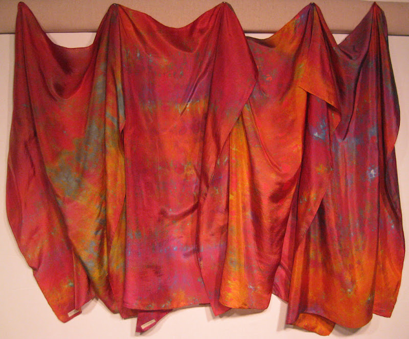
Four silk scarves from an especially good dyeing session. The colors are really amazing in person.
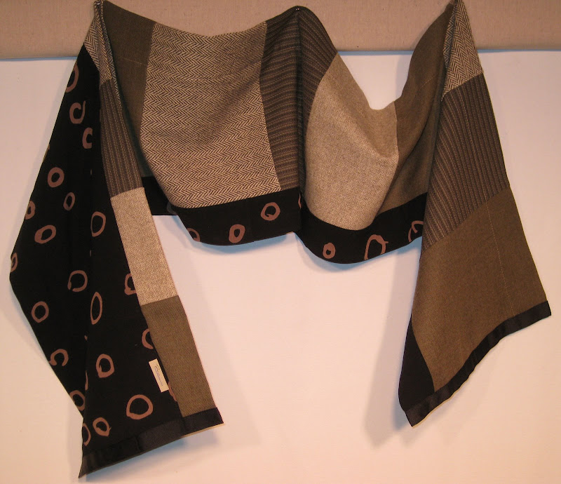
The picture below is a sample of some of the constructed scarves I've been making They've been very popular. This particular one combines commercial wool, and my discharged black rayon. It's basically a tube with a pieced front. The whole thing is assembled with a serger. The tube ends are squared up, sewn shut, then finished with grosgrain ribbon. I'm doing a similar type of scarf with polar fleece flatlocked together.
Finished commission work
I picked up a commission for some dyed and printed yardage a while back and was worried that I would never be able to fit it into my schedule. I'm happy to say that I did fit it in and am delighted with the results. Let's just hope the client shares my enthusiasm.
Both pieces are viscose rayon challis. I've sourced this cloth from Test Fabrics and Dharma and they are different. The Dharma cloth is the same that they use in their rayon garment blanks. It's got a nice hand and the sort of drape that you expect from rayon. The Test stuff seems a bit courser. Both are nice but the Dharma seems better suited to garments, which is the ultimate use for these commission pieces.
So, here's the first piece. I used a mixture of low water and full immersion, plus some direct dye application. The client requested deep purple with highlights of blue and other jewel tones. I think I hit the mark. I have to give credit here to the color mixing techniques that I learned from Carol Soderlund. I picked the purple I wanted and I got it. I have to admit that I'm going to be sorry to see this go away. I could make some cool stuff out of this.

The second piece is printed. The request was fantastic. It's what all artists dream of--something to the effect of, "I love your work and I love strong color...go for it." For this one I've got in-progress shots.
First, some energetic black lines and broad painterly marks to create a strong foundation and establish the beginning of a color palette.
This cloth is going to become a shirt, so I had to rein in my desire for large-scale pattern. In the next shot you can see the 3rd, 4th, and 5th dye applications. the brown squares (ProChem Kahki) were screened with screen that I "damaged" earlier this year by leaving water soluable glue resist in it for too long. Now whenever I print with it I get these ghost patterns. It's one of the most productive mistakes I made in a while. The circles came next to expand the palette and pull the counter balance out the angles of the squares with some curves. The 5th layer was a screening of blue dots over the entire surface (seen in the background).

I might have been able to stop with that, but I was concerned about the strong contrast of the white background. A blue background was the perfect solution. The only problem is that I couldn't do that as a dye bath without altering many or all of the other colors already layed down. So...I spent a day hand painting the whole thing. It was the right thing to do, but very time consuming.

The washed version of the cloth is pretty much the same. Of course I had some dye loss, but generally got very good strike--gotta love that rayon.
Because these two pieces will be made into shirts, and because the dyerslist e-mails this week have been full of good reminders about the need for high-temperature washout for reactive dyes, AND because I didn't want to dye my client and his partner shades of purple--I soaked both of these pieces in 180 degree water. I was surprised by how much residual dye came out, but even after a final long wash cycle they both look bright and strong. I don't generally do REALLY hot washouts, but might need to reconsider that in the future.
A stay of execution
I got excellent news from the cardiologist today. The nuclear stress test showed all healthy heart tissue and vessels, and normal ventricles. That's good news. While there's still no explanation for my recent "event", the next step is watchful waiting rather than surgery. More good news. He told me to go back to the gym (with a couple of restrictions) for some mild exercise and to schedule follow-up in 2 months.
On one hand this all sounds rather tentative, but on the other hand waiting is not all bad. The longer things work OK and remain intact the better off I'll be. All told, it's an excellent early Christmas present.

Colorful thoughts
I'm back from the cardiologist safe, sound, and radioactive. I'm not sure how long I'm going to be emitting gamma rays, but I was warned not to go near any airports without a note of explanation from my doctor. Apparently I will set off all sorts of alarms for the next 24 hours! Come to think of it, I'm glad I decided not to stop at the mall on the way home. I'm sure the store security systems would have loved me. The test seemed to go well. The treadmill part was comparable to previous tests (10 minutes, no instability, good recovery). I won't know the results of the nuclear imaging until next week, but the doctor seems confident that it will show good muscle and good vascular flow. What that adds up to is very little quantitative evidence that now is the time for surgery; just qualitative evidence. His last word were, "We'll talk next week." And so we will.
OK. As promised...pictures of recent work. I think I've mentioned that I'm working on cloth for two shows: "Quake" and "My Island". The island thing is really tripping me up. My responses have been very literal--I mean like drawing islands. I can meditate my way through all of the meanings of island: isolation, paradise, connection to other islands, even the shaky economy of many islands. I still end up with literal things coming out. Last week I gave in and printed a "pretty" sort of island-inspired piece of rayon and I really like it. It makes me think of trips to the Caribbean. Simple-minded, but nice. Its the piece in the middle with the orange flowers. Click the image to see more detail.

I liked the way that it looked. The basic sketch was done with black dye in a dental syringe. I could draw this way for hours. (I really need to do a monochromatic piece with just gesture drawing). The orange petals, brown centers, and leaves are all done as polychromatic screen prints. I do my polychromatic printing wet, not dried and deconstructed--paint it and pull it. In this case I was using a small scraper and pulling small areas at various angles. Anyway, it all seemed to come together with a nice sort of Matisse feel except for the violet color in the background. It was dead. Ergo, the title of this post, "Colorful thoughts".
The next time I went into the studio I painted a brighter blue into the background and it all came together. I think it's sort of a split complement thing. The violet was not a true complement to the orange. Adding the blue pushed the background and foreground a little further apart on the color wheel. What you see below on the floor had not been washed out yet. The color stood up very well and washing opened up the resist lines that are in the flower petals for a little more detail. I promise a "proper" photo of the finished piece soon.

OK. That has to be all for now. I've got scarves to sew.