
Thoughts, news, and more
Recent posts

Color: Days 4-5
I got home so late last night that there was no way that I was going to post. That means that you get a condensed version of the last two days. Heavy on the pictures and light on the words.
This is the crit wall from late yesterday morning showing all of the free studies created from the proportional color inventory exercise that I finished Wednesday night. The caliber of the work was really amazing. You can find mine in the 2nd picture. I did a very geometric design from the color inventory and a much more abstract design in reverse proportion . Can you tell that it rained for 4 days this week?


There was more crit, more discussion, and more work in between, but cutting to the chase, here are shots from the final crit. We were to pick 2 of our best free studies.

Everyone's work just kept getting better. I think we all agreed that if we could have a day of rest and resume work next week with a focus on design we could do even more. Perhaps that's a class for another year.
For now, I'm off to meet some folks for dinner, then back to pack, and fly home tomorrow morning. It's been great, but I'm ready to go home. Dan and I have been off on separate adventures this week: me to Ohio and him to NJ to visit family and play golf with his brothers, then on to Hyde Park for a couple of days of quiet and Holy Cross, then home just long enough to eat and sleep before heading to car show in PA. We've both got Saturday and Sunday to be home together and get our feet back on the ground before it's back to work on Monday.
Color: Day 3
How did it get to be day 3? Another 12-hour day, but today it flew by--well at least the afternoon did. We spend the morning discussing progressions (hue, value, design, etc) and color interaction. From about 1 until 830 we did Albers-style color interaction studies and started working on proportional color inventory exercises from the color research chapter of the book. This is all helping me so much.
The photo below is part of a wall full of color interaction studies. They are designed to show how different surrounding color change the way we perceive the value and hue of a single enclosed color. It has tremendous design implications. Mine is the one in the middle. The colors don't really read true in the photo, but I offer it as proof that I'm working hard.

This one study is designed to show how all of the principles--shifting hue, shifting value, and shifting both by carefully selecting various surrounding colors.

The last thing I did before going home was to glue up this proportional color inventory taken from a photo of a mosaic. Each square at the bottom represents the proportion of the color that appears in the image. I think I'm close, but not perfect. We had to mix all of the colors ourselves and I'm pleased with how close I came (It really does look better in person). Tomorrow we'll build a design using these colors and proportions. I hope we're doing an inverse study as well.

Rain and paper collage
Those were the themes for the day; very much a continuation of yesterday.
Here's the approach of the rain as seen from the driveway leading to the barn. It cut my walk short but it was wonderful to see such an expanse of beautiful, rich, cloudy sky. At home there are so few places to see wide open sky.

And here's the growing wall of collage color exercises. I took this shot just as we were about to begin our first group crit. right before dinner.

When I arrived I was a little leery about painting for a whole week, but I must say that I'm really learning a great deal and I know that this will help me when I get home. In fact, I'm wishing that I could get back into my studio to put some of what I've learned into practice on cloth. That's a good sign. I can also see the collage have an impact on my future work. I've been wanting to do some mixed fiber/paper sewn pieces and this week plays right into that.
I'm also starting to think about taking a class with Nancy. It's an intimidating thought. Most people show up with about 200 yards of fabric. I'm not exaggerating! If I dyed it all myself it could take me a year and a small fortune to prepare. Then again I would have quite a collection of fabric. We're putting in 12-hour days. Most of her students are working 15's. That about a 70-hour week. Maybe next year...
So, one last thing. After two days with David I can say that the following photo is a relatively high key composition of mostly chromatic grays with one anomalous element; and that the green leaf acts as a bridge color between the blue overtone of gray gravel and the yellow flower. I knew all of that before. Now I have a better vocabulary for describing it. This week is time well spent.

Greetings from Ohio
I'm in Ohio this week at the Nancy Crow Timber Frame Barn taking a class with David Hornung called "Color: A Workshop for Artists & Designers" It's based on his book by the same name, which he developed after teaching color theory for years at places like the Rhode Island School of Design. By his own description we're cramming a 16-week class into 5 days. Today was the first 12 hours of it.
I'm so glad I flew here this time instead of driving. I'm pooped as it is. Driving all day yesterday would not have made it any easier.
Today was a morning of lecture and the rest of the day painting 4x4" color swatches and critiquing them. Lots of swatches.

It sounds tedious, but between mixing, painting and sorting all of these chromatic grays and muted colors I finally understand the part of color that has confused me for the longest time, saturation. Hue and value--no problem. That's just what one might typically call color (red, blue, etc.) and light or dark. Saturation is about the concentration of hue. It's still hard to explain, which might be why I've had trouble understanding other people's written descriptions, but today as I was mixing paint it finally clicked.
Tomorrow we cut up the painted squares and collage them together into color studies. Wednesday, who knows. I'm just taking this one day at a time.
OK, off to bed, then up early to read two chapters over breakfast, and off to the barn.

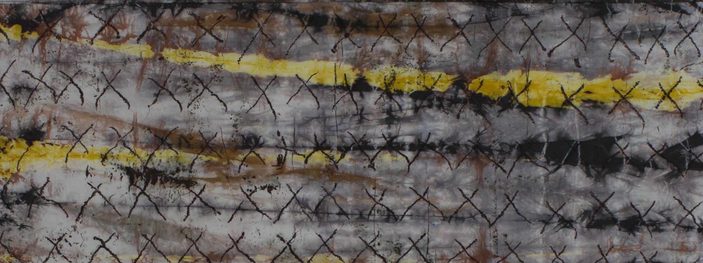
Flour paste resist - after pictures
As promised, here are the "after" pictures from one of my flour paste resist experiments. I soda-soaked the yard of rayon before applying a thin-ish flour paste using a squeeze bottle.

In the detail shot below you can see that there's a halo around the lines. I think that the water in the paste migrated into the fiber and pushed some of the soda ash away from the flour paste. I let the paste dry on the cloth overnight and I think that helped produce good contrast. Cleanup was a lot easier than I thought. After a bit of soaking, most of the paste flaked off. The rest dissolved. After a trip through the washer there's no trace of the flour.

Must post
My last post was on March 2. What a scandal. I still consider this blog to be active. It's just lethargic, that's all.
OK, really quick, I've got three photos to share. First, I was so proud to see "Seeds of Change" at the Laurel Art Guild show. It's been up most of the month of March and closes this weekend. The show was hung very nicely. There were a couple of other fiber pieces--all of us very different from each other. This is the first time I've seen my work in a show that included other media. It is interesting to see how very different fiber feels from everything else.

Second, I've been experimenting with flour paste resist. I love my soy wax but the wash out is kind of a mess (I know, I should be on my knees thanking God for soy wax instead of paraffin). So here's a piece in process. At this point it hasn't been washed out, but you can see where the flour resist is. It worked very well. I'll post an "after" pic soon.
And finally--brace yourself--I got it into my head that I needed to save torn scraps of cloth (selvages, etc.) and turn them into something. I decided to do some completely unstructured, uninhibited, and unorthodox crochet.

I started out just goofing around, but I think this might turn into something. Who knows? This might be turning into a piece that I could submit for the studio "Island" show.
And, ugh, speaking of the studio. It's almost time to reapply for my residency. My original award was for a little shy of one year. We need to reapply every year in an open competitive process. I went back and forth about whether to apply again. Now I'm committed. I really do want to stay. I feel like I've got more work to do in that space. Fingers crossed.
"Controlled" chaos
Notice the title. That was my workshop yesterday. I can't say that there was that much control, hence the quotes. But, that was a good thing. Yesterday I led a workshop at the community center (notice I did not use the word taught). Lots of kids and a few adults brought in shirts or other garments and painted, stamped, and stenciled all over them. I made plans, and samples; I set up workstations and did demos for my assistants. We were ready when the first person came through the door at 1pm. Over the course of 2 hours we must have had 50 people. The workstations dissolved into all sorts of work happening everywhere. And, it was fearless work. I expected there would be a couple of very tentative folks who would be cautions about making the first mark. Kids just are not like that.
The stuff they did was great. They were using freezer paper to make iron-on stencils. They cut out adhesive-baked foam and stuck it to foam core to make stamps and printing blocks. They painted freehand. We were working in a really well stocked art room. Lots of the kids had been to other activities there before. Let me tell you, if they wanted something that I didn't supply they asked for it politely and in come cases showed me where to find it on the shelves. After two hours I was worn out. I don't interact with a lot of kids on a regular basis. They generate a level of mental stimulation that I'm not used to. It was great, but whew. I have a renewed admiration and appreciation for all of you out there who are teachers and parents. How do you do it?
Here's a picture of some of the folks at work. Barbara and Ann, the organizers, are standing in the back. They were great helpers and cheerleaders.
Here's a small sample of some of the work. I saw some pretty uninhibited stuff.
And finally, here's a picture of my most valuable helpers. They are the reigning Miss Greenbelts in various age groups. Along with their titles comes a commitment to a year of community service. They help out at all of the Artful Afternoons and they are dynamos: setting up, cleaning up, helping the other kids, everything. This photo was taken at the end of the workshop. Notice the benches are all on top of the tables. They washed everything in sight, cleaned the tables, then put the bench on top so they could SWEEP THE FLOOR. Amazing.

You also have to notice the tiaras and sashes. Each young lady arrived carrying what appeared to be a jewel-encrusted Lucite purse. I'm thinking to myself, "Is this some new teen fashion to which I am oblivious?" No, it's what they use the transport their tiaras, which they wore with pride all day. They were polite, articulate, friendly and have my deepest gratitude.
Big week
When it rains it pours, and this time it's pouring good news. This week I found out that my art quilt, "Seeds of Change" (below) was accepted into the 40th Annual Laural Art Guild Open Juried Exhibition (March 6-29 at the Montpelier Art Center in Laurel, MD). I'm very excited to have a piece accepted into a show that covers a full range of media, not just fiber. That's a first for me.

And...my art cloth piece titled "Spiral 2: Tremor" was accepted into the Art Cloth Network "Quake" show (October 2009, Archway Gallery, Houston, TX). I'm in some really outstanding company for this show and...I don't know what to say. I'm humbled and proud at the same time.
Something old, something new
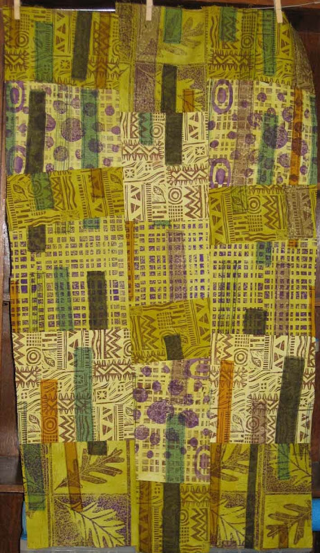
Let's start with the "new". I've really been in the mood to print lately and been having fantasies about buying a relief press. An intaglio press would be even better, but considerably more expensive. What you see here is a pieced composition that started as a single sheet of white muslin onto which I fused torn strips of cloth (commercial and hand-dye). That got hacked into 5 strips and printed in brown and purple using a variety of blocks, stamps, and plates that I've created over the last few years. Each strip then got dyed in a different value of a color gradation of green. Then came topsitiching on the fused pieces, some more chopping, resewing of the strips in to a whole cloth, and finally chopping and resewing that. I like the way it turned out. At each step I gave myself specific design limitations (color palette, type of stitching, geometric form, etc.) and forced myself to resolve the design issues within those limits. For example, when I was cutting I said that cuts could be off of orthogonal, but no strong diagonals. I think that the composition is well along, but I'm letting it rest on the studio wall for a while as I contemplate the quilting layer and what that might bring.
Now onto the "old". I should really string this out to more than one post, but what the heck. I dyed, and pieced this quilt top over a year ago and it's been languishing at home waiting for whatever comes next. This week I took it into the studio and hung it on the design wall to get a better view of it. I really can't do that at home.
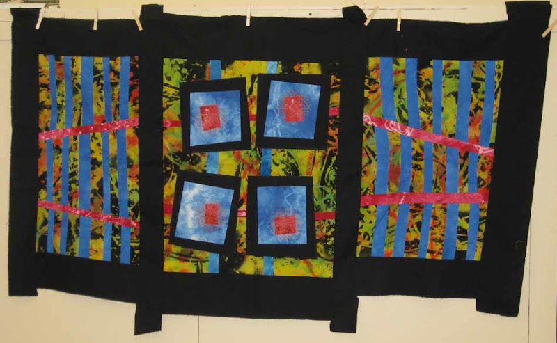
The piece started with a length of discharged and over-dyed black rayon. It was great before the over-dye, and I should have left it alone--story of my life. I went into the piece with the intention of creating a triptich form (three panels). The give in the rayon allowed me to add subtle curves to some of the straight lines and throughout the composition I intentionally played with angles. (I truely CAN sew two seams at a right angle--I swear.) The working title was "Common Ground", but I'm no longer sure that applies. It is somehow more about space. The two side panels, with their strong grid pattern seem like gates to me, which was an intentional play on the idea of a triptich, but the way the red lines are angled toward convergence points on the outer edge of the composition almost creates an illusion that the panels are bent backward, rather than out toward the viewer (particularly on the left). The tabs of black border fabric that extend from the top and bottom are just leftovers from piecing that didn't get trimmed away. Left as they are they give the piece the feel of a japanese screen. I now think they are an important part of the overally feel and plan to leave then on. I had a long informal crit session with my studio-mate, Tom, which was very helpful. I'm now considering ways that I might extend some of the design into the black border, perhaps using stitching.
