Thoughts & news
Dry spell for the blog
I'm still here, but judging from this blog you'd never know it. It seems that I'm going through another writing dry spell. Work is busy, the studio is busy, and Dan and I are recently returned from a trip to Cape Cod. It was lovely; so very quiet this time of year. I've been back into the studio for about a week getting ready for an open studio today. I should find out this week if my studio residency has been renewed for next year.
I'm still anticipating surgery in August. I say anticipating because I won't know for sure until I meet the surgeon in July. If I'm being honest though, it's far more sure than not. I'm starting to feel as though I'm running up against a deadline; as if there are things that must get done before the end of July, most of which really don't need to done. It'll all be there when I'm back on my feet. Right?
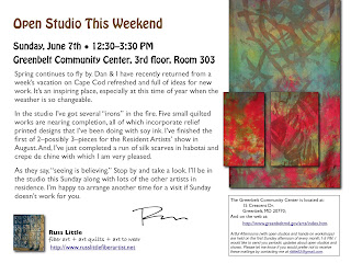
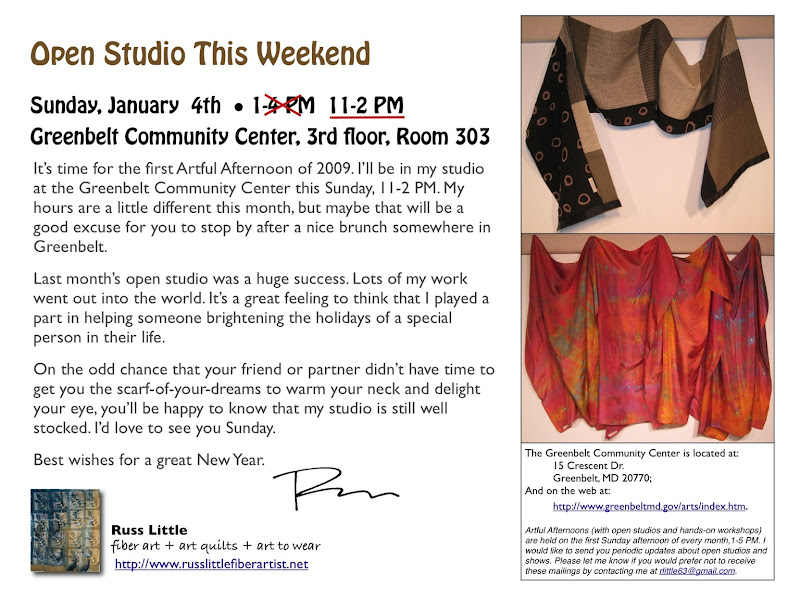
So, that's just the quickest of updates. I've got pics of what's happening in the studio. Perhaps I'll post them in the next day or so. For now, here's this month's open studio announcement. I've just finished a batch of about a dozen scarves in silk habotai and crepe de chine. It's amazing to see how the two fabrics take the dye differently. I'm really starting to love the crepe.
Home again
I'm back from Ohio after an uneventful flight. I really do love Southwest. Nobody's perfect, but they're way better than average.
After a week of hard work at the Barn I've been thinking a lot about just that--hard work. Yes, I have my lazy, slack-jawed moments in front of the TV, but generally I think I'm pretty hardworking. Or, perhaps it's just that I'm in constant motion--mental and/or physical. The last week has reminded me of the importance of spending time on an idea or design and going deeper; approaching it from different angles and resolving issues. Looking back at my work for the last year it has been, to a large extent, a series of one-offs. Now I'm feeling the need to focus on design work and to do more series work. In doing so I think that I will improve my critical eye and ultimately improve as an artist. I've also got to develop a mentoring relationship of some sort, either here or somewhere reachable by mail. I need some consistent critical feedback.
For the last couple of years I've tried to set a developmental goal. The goal for the last 12 months was to improve my knowledge of color theory and my use of color. I believe I've achieved that, though clearly a lifetime of applying and refining lies ahead. I think that the goal for the coming year is going to be to create a body of work that:
- Covers a limited number of themes
- Explores each design through several media (e.g., art cloth, art quilt, painting, drawing, photography)
- Includes design and color iterations (i.e., the same piece executed in multiple design variations)
- Applies what I have learned about color
- Requires a deeper study of design principles
If I can do that in 12 months (along with everything else that's on the calendar) then it will be a banner year. Someone blow the starting whistle.
Color: Days 4-5
I got home so late last night that there was no way that I was going to post. That means that you get a condensed version of the last two days. Heavy on the pictures and light on the words.
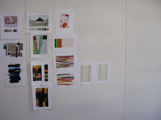
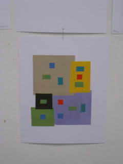
This is the crit wall from late yesterday morning showing all of the free studies created from the proportional color inventory exercise that I finished Wednesday night. The caliber of the work was really amazing. You can find mine in the 2nd picture. I did a very geometric design from the color inventory and a much more abstract design in reverse proportion . Can you tell that it rained for 4 days this week?
There was more crit, more discussion, and more work in between, but cutting to the chase, here are shots from the final crit. We were to pick 2 of our best free studies.
Everyone's work just kept getting better. I think we all agreed that if we could have a day of rest and resume work next week with a focus on design we could do even more. Perhaps that's a class for another year.
For now, I'm off to meet some folks for dinner, then back to pack, and fly home tomorrow morning. It's been great, but I'm ready to go home. Dan and I have been off on separate adventures this week: me to Ohio and him to NJ to visit family and play golf with his brothers, then on to Hyde Park for a couple of days of quiet and Holy Cross, then home just long enough to eat and sleep before heading to car show in PA. We've both got Saturday and Sunday to be home together and get our feet back on the ground before it's back to work on Monday.
Color: Day 3
How did it get to be day 3? Another 12-hour day, but today it flew by--well at least the afternoon did. We spend the morning discussing progressions (hue, value, design, etc) and color interaction. From about 1 until 830 we did Albers-style color interaction studies and started working on proportional color inventory exercises from the color research chapter of the book. This is all helping me so much.
The photo below is part of a wall full of color interaction studies. They are designed to show how different surrounding color change the way we perceive the value and hue of a single enclosed color. It has tremendous design implications. Mine is the one in the middle. The colors don't really read true in the photo, but I offer it as proof that I'm working hard.
This one study is designed to show how all of the principles--shifting hue, shifting value, and shifting both by carefully selecting various surrounding colors.
The last thing I did before going home was to glue up this proportional color inventory taken from a photo of a mosaic. Each square at the bottom represents the proportion of the color that appears in the image. I think I'm close, but not perfect. We had to mix all of the colors ourselves and I'm pleased with how close I came (It really does look better in person). Tomorrow we'll build a design using these colors and proportions. I hope we're doing an inverse study as well.
Rain and paper collage
Those were the themes for the day; very much a continuation of yesterday.
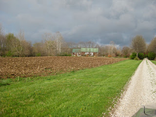
Here's the approach of the rain as seen from the driveway leading to the barn. It cut my walk short but it was wonderful to see such an expanse of beautiful, rich, cloudy sky. At home there are so few places to see wide open sky.
And here's the growing wall of collage color exercises. I took this shot just as we were about to begin our first group crit. right before dinner.
When I arrived I was a little leery about painting for a whole week, but I must say that I'm really learning a great deal and I know that this will help me when I get home. In fact, I'm wishing that I could get back into my studio to put some of what I've learned into practice on cloth. That's a good sign. I can also see the collage have an impact on my future work. I've been wanting to do some mixed fiber/paper sewn pieces and this week plays right into that.
I'm also starting to think about taking a class with Nancy. It's an intimidating thought. Most people show up with about 200 yards of fabric. I'm not exaggerating! If I dyed it all myself it could take me a year and a small fortune to prepare. Then again I would have quite a collection of fabric. We're putting in 12-hour days. Most of her students are working 15's. That about a 70-hour week. Maybe next year...
So, one last thing. After two days with David I can say that the following photo is a relatively high key composition of mostly chromatic grays with one anomalous element; and that the green leaf acts as a bridge color between the blue overtone of gray gravel and the yellow flower. I knew all of that before. Now I have a better vocabulary for describing it. This week is time well spent.
Greetings from Ohio
I'm in Ohio this week at the Nancy Crow Timber Frame Barn taking a class with David Hornung called "Color: A Workshop for Artists & Designers" It's based on his book by the same name, which he developed after teaching color theory for years at places like the Rhode Island School of Design. By his own description we're cramming a 16-week class into 5 days. Today was the first 12 hours of it.
I'm so glad I flew here this time instead of driving. I'm pooped as it is. Driving all day yesterday would not have made it any easier.
Today was a morning of lecture and the rest of the day painting 4x4" color swatches and critiquing them. Lots of swatches.
It sounds tedious, but between mixing, painting and sorting all of these chromatic grays and muted colors I finally understand the part of color that has confused me for the longest time, saturation. Hue and value--no problem. That's just what one might typically call color (red, blue, etc.) and light or dark. Saturation is about the concentration of hue. It's still hard to explain, which might be why I've had trouble understanding other people's written descriptions, but today as I was mixing paint it finally clicked.
Tomorrow we cut up the painted squares and collage them together into color studies. Wednesday, who knows. I'm just taking this one day at a time.
OK, off to bed, then up early to read two chapters over breakfast, and off to the barn.
Flour paste resist - after pictures
As promised, here are the "after" pictures from one of my flour paste resist experiments. I soda-soaked the yard of rayon before applying a thin-ish flour paste using a squeeze bottle.
In the detail shot below you can see that there's a halo around the lines. I think that the water in the paste migrated into the fiber and pushed some of the soda ash away from the flour paste. I let the paste dry on the cloth overnight and I think that helped produce good contrast. Cleanup was a lot easier than I thought. After a bit of soaking, most of the paste flaked off. The rest dissolved. After a trip through the washer there's no trace of the flour.
Must post
My last post was on March 2. What a scandal. I still consider this blog to be active. It's just lethargic, that's all.
OK, really quick, I've got three photos to share. First, I was so proud to see "Seeds of Change" at the Laurel Art Guild show. It's been up most of the month of March and closes this weekend. The show was hung very nicely. There were a couple of other fiber pieces--all of us very different from each other. This is the first time I've seen my work in a show that included other media. It is interesting to see how very different fiber feels from everything else.
Second, I've been experimenting with flour paste resist. I love my soy wax but the wash out is kind of a mess (I know, I should be on my knees thanking God for soy wax instead of paraffin). So here's a piece in process. At this point it hasn't been washed out, but you can see where the flour resist is. It worked very well. I'll post an "after" pic soon.
And finally--brace yourself--I got it into my head that I needed to save torn scraps of cloth (selvages, etc.) and turn them into something. I decided to do some completely unstructured, uninhibited, and unorthodox crochet.
I started out just goofing around, but I think this might turn into something. Who knows? This might be turning into a piece that I could submit for the studio "Island" show.
And, ugh, speaking of the studio. It's almost time to reapply for my residency. My original award was for a little shy of one year. We need to reapply every year in an open competitive process. I went back and forth about whether to apply again. Now I'm committed. I really do want to stay. I feel like I've got more work to do in that space. Fingers crossed.
"Controlled" chaos
Notice the title. That was my workshop yesterday. I can't say that there was that much control, hence the quotes. But, that was a good thing. Yesterday I led a workshop at the community center (notice I did not use the word taught). Lots of kids and a few adults brought in shirts or other garments and painted, stamped, and stenciled all over them. I made plans, and samples; I set up workstations and did demos for my assistants. We were ready when the first person came through the door at 1pm. Over the course of 2 hours we must have had 50 people. The workstations dissolved into all sorts of work happening everywhere. And, it was fearless work. I expected there would be a couple of very tentative folks who would be cautions about making the first mark. Kids just are not like that.
The stuff they did was great. They were using freezer paper to make iron-on stencils. They cut out adhesive-baked foam and stuck it to foam core to make stamps and printing blocks. They painted freehand. We were working in a really well stocked art room. Lots of the kids had been to other activities there before. Let me tell you, if they wanted something that I didn't supply they asked for it politely and in come cases showed me where to find it on the shelves. After two hours I was worn out. I don't interact with a lot of kids on a regular basis. They generate a level of mental stimulation that I'm not used to. It was great, but whew. I have a renewed admiration and appreciation for all of you out there who are teachers and parents. How do you do it?
Here's a picture of some of the folks at work. Barbara and Ann, the organizers, are standing in the back. They were great helpers and cheerleaders.
Here's a small sample of some of the work. I saw some pretty uninhibited stuff.
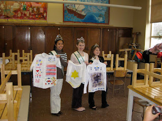
And finally, here's a picture of my most valuable helpers. They are the reigning Miss Greenbelts in various age groups. Along with their titles comes a commitment to a year of community service. They help out at all of the Artful Afternoons and they are dynamos: setting up, cleaning up, helping the other kids, everything. This photo was taken at the end of the workshop. Notice the benches are all on top of the tables. They washed everything in sight, cleaned the tables, then put the bench on top so they could SWEEP THE FLOOR. Amazing.
You also have to notice the tiaras and sashes. Each young lady arrived carrying what appeared to be a jewel-encrusted Lucite purse. I'm thinking to myself, "Is this some new teen fashion to which I am oblivious?" No, it's what they use the transport their tiaras, which they wore with pride all day. They were polite, articulate, friendly and have my deepest gratitude.
Big week
When it rains it pours, and this time it's pouring good news. This week I found out that my art quilt, "Seeds of Change" (below) was accepted into the 40th Annual Laural Art Guild Open Juried Exhibition (March 6-29 at the Montpelier Art Center in Laurel, MD). I'm very excited to have a piece accepted into a show that covers a full range of media, not just fiber. That's a first for me.
And...my art cloth piece titled "Spiral 2: Tremor" was accepted into the Art Cloth Network "Quake" show (October 2009, Archway Gallery, Houston, TX). I'm in some really outstanding company for this show and...I don't know what to say. I'm humbled and proud at the same time.
Something old, something new
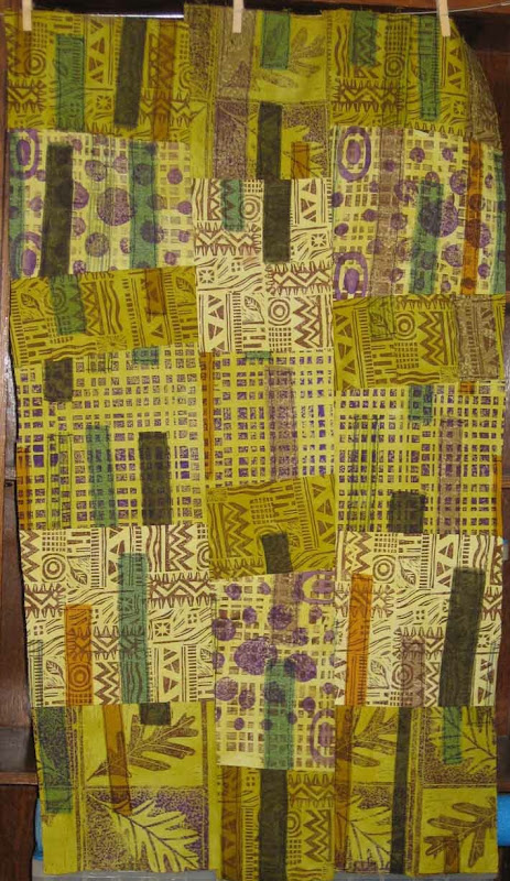
Let's start with the "new". I've really been in the mood to print lately and been having fantasies about buying a relief press. An intaglio press would be even better, but considerably more expensive. What you see here is a pieced composition that started as a single sheet of white muslin onto which I fused torn strips of cloth (commercial and hand-dye). That got hacked into 5 strips and printed in brown and purple using a variety of blocks, stamps, and plates that I've created over the last few years. Each strip then got dyed in a different value of a color gradation of green. Then came topsitiching on the fused pieces, some more chopping, resewing of the strips in to a whole cloth, and finally chopping and resewing that. I like the way it turned out. At each step I gave myself specific design limitations (color palette, type of stitching, geometric form, etc.) and forced myself to resolve the design issues within those limits. For example, when I was cutting I said that cuts could be off of orthogonal, but no strong diagonals. I think that the composition is well along, but I'm letting it rest on the studio wall for a while as I contemplate the quilting layer and what that might bring.
Now onto the "old". I should really string this out to more than one post, but what the heck. I dyed, and pieced this quilt top over a year ago and it's been languishing at home waiting for whatever comes next. This week I took it into the studio and hung it on the design wall to get a better view of it. I really can't do that at home.
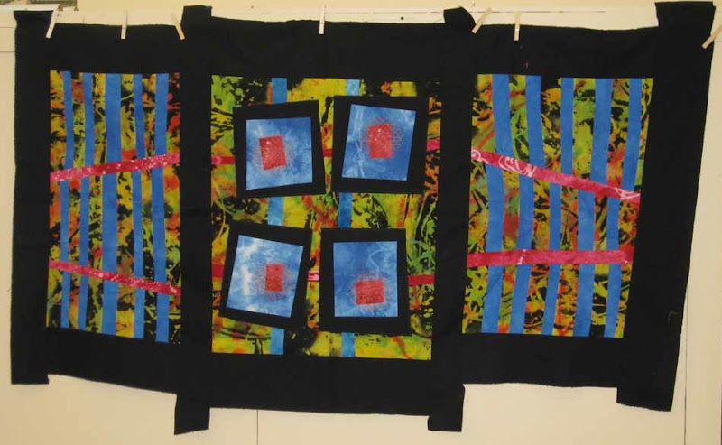
The piece started with a length of discharged and over-dyed black rayon. It was great before the over-dye, and I should have left it alone--story of my life. I went into the piece with the intention of creating a triptich form (three panels). The give in the rayon allowed me to add subtle curves to some of the straight lines and throughout the composition I intentionally played with angles. (I truely CAN sew two seams at a right angle--I swear.) The working title was "Common Ground", but I'm no longer sure that applies. It is somehow more about space. The two side panels, with their strong grid pattern seem like gates to me, which was an intentional play on the idea of a triptich, but the way the red lines are angled toward convergence points on the outer edge of the composition almost creates an illusion that the panels are bent backward, rather than out toward the viewer (particularly on the left). The tabs of black border fabric that extend from the top and bottom are just leftovers from piecing that didn't get trimmed away. Left as they are they give the piece the feel of a japanese screen. I now think they are an important part of the overally feel and plan to leave then on. I had a long informal crit session with my studio-mate, Tom, which was very helpful. I'm now considering ways that I might extend some of the design into the black border, perhaps using stitching.

What think you I take my pen in hand to record?
WHAT think you I take my pen in hand to record?
The battle-ship, perfect-model'd, majestic, that I saw
pass the offing to-day under full sail?
The splendors of the past day? Or the splendor of the
night that envelops me?
Or the vaunted glory and growth of the great city
spread around me?—No;
But I record of two simple men I saw to-day, on the pier,
in the midst of the crowd, parting the parting of dear friends;
The one to remain hung on the other's neck, and passionately kiss'd him,
While the one to depart, tightly prest the one to remain in his arms.
I can't think of why this line popped into my head. Perhaps because I sat down to write and I didn't know about what. Lately I feel as though I'm stuck in a loop (once a programmer; always a programmer). I finish something (or almost) , and then it's off to the next big thing; repeat. I suppose life is meant to be like that, but I also think there needs to be some just plain "being" every once in a while.
My big batch of show submissions are all out but no word yet. I confess that I blew off at least one show opportunity because I just couldn't fit it in. The next 3 weeks are focused mostly on church work. The Rector search has moved from high gear into something akin to warp speed. We (the committee) are conducting 4 2-day visits/interviews over the next 3 weeks. The candidates come to visit us, we show them around the area, wine & dine, and interview them. With luck (I suppose that should be faith & prayer) we will be having a committee retreat in early March to select the final 3. They will advance to the lightening round--I mean they will meet with the Vestry for another round of interviews. I'm hoping for white smoke before the daffodils fade. It's all very exciting, but it's overwhelming at times. Right now we have four great candidates and somehow we have to discern a mutual call between one individual and our community.
So, that's all rattling around in my head along with this community art workshop that I'm teaching on March 1. BIG LESSON: less is more. My grand plan is way to grand to pull off and I'm trying to scale back. For 1 thing, I was planning on having people combine paint and fusible fabric to do surface design on clothing. Here's what I've learned from making samples:
- Fusible adheres very well to cloth that has fabric paint on it...until it goes trough the washer. Fusible is out. Let's not talk about the bolt of Wonder Under that I now own. Let's just say that I'm going to be doing a lot of applique.
- Finished garments are a pain to work with. And, the pleat in the back of a man's dress shirt is in the way. Shirts are too big to start with. Do we really need that much more fabric?
- You can make low-cost stamps out of self adhesive craft foam, a pair of cheap scissors, and a scrap of foam core.
My repertoire now consists of freezer paper mask/stencil, stamping, and free hand painting. Folks are supposed to bring their own shirt to work on. I'll probably bring some muslin squares and poster board for the kids just in case. Send a prayer my way on the first of March. Gasp.
I swear I meant for this to be an upbeat post. I'm not sure it reads that way. Not to worry. Spring is on the way and that always seems to change everything.

What's new?
So, what IS new? As recently reported, I finished my Quake entries for the ArtCloth Network show and got them shipped off for review just before the deadline. A week after my dash to the post office I was delighted to receive a nice note from the curator saying my submissions were good and would I like have an additional piece considered. I confess, that really felt good. That set off another scramble to photograph and submit another piece. Done.
Last week was another mad dash. This time it was a submission for the Laurel Art Guild annual open exhibition. I submitted my art quilt, "Seeds of Change". It's probably the most painterly piece that I've got at the moment and seemed the most appropriate for a show that's open to all media. This is my first "art show" submission (by which I mean--tongue in cheek--it's not fiber-focused). I'm not sure how much experience the group has with fiber artists. We shall see. I think getting into this show would be a good thing all around.
There's more.
I'm gearing up for a workshop I'm teaching on March 1: "Reinvent your old Clothing". It's a drop-in workshop at the community center, which means all ages and all skill levels. I've got plenty of experience teaching in both technical and academic environments. Teaching art is something new to me. It's certainly something I'm interested in doing. That doesn't mean that I'm not more than a little intimidated. We're going to be painting and fusing on shirts that folks dig out of the back of their closets. Cool idea, but can I pull it off? With help I think so. Stay tuned. Better still, grab and old dress shirt you never wear and come to the workshop (3/1, 1-3pm, Greenbelt Community Center).
And finally, yesterday I gave a presentation for the Sunday morning Adult Forum at my church as part of a series on the intersection of art and faith. I had a great time preparing for it and doing the presentation. It's a topic close to my heart and one of great interest. I'm thinking about reworking and expanding the presentation into something more about the experience of discernment and call from an artist's perspective--how to ask the questions and what might happen as a result. I have to give that one some more thought. Who's the audience? How would I market a presentation like this? Do I even have the credibility to say anything on this topic beyond my own experience? All questions for later.
Sorry no pictures today. Next time. I promise.
Is this art?
Don't answer that. January has proven to be just as busy as expected; perhaps even more so. Let's see, after spending much of the first 2 weeks out of the studio with my cold-from-hell (which is still lingering) I have:
- Quilted and finished a new quilt that I've been picking away at for a while (pics below).
- Did edge finishing on 2 2-yard pieces of art cloth, photos, and submission package for the Art Cloth Network Quake show.
- Sewed rod pockets on a couple of other quilts.
- Beaded a portion of another quilt top that is now sandwiched up and ready to quilt (again, no pics yet...soon I promise).
- Assembled a 20 x 34 quilt top (no pics 'till it's further along).
That brings me back to my title question: Is this art? It feels like frenzy. Most of it is directed at trying to get in my required 30 studio hours in two weeks. I just keep reminding myself that I asked for this--dreamed of it--and worked hard to get here.
Again, back to the title question. Consider the following pictures and ask yourself: Is this art?
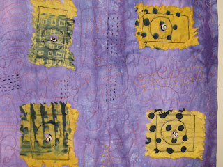
A detail shot...
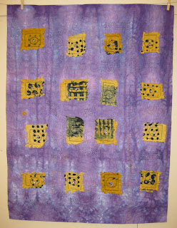
I call it "Emerge". It's about things emerging from some sort of enclosure--especially thinking of seeds. The background is whole cloth. The tan/gold squares are gelatin prints that have been fused, and clipped. There's a lot of hand stitching in the background--rows of running stitch that are meant to evoke rows of planted seeds. The overall strong geometry is supposed to be about the geometry of planted fields. Blah, blah, blah. This is starting to sound very pretentious.
Anyway, the issue that I have with this piece is related to the strength of the images. Up close, the texture and the play of light contribute significantly to the visual interest. Much of this texture is lost when the piece is viewed from a distance. It looks a bit like squares stuck on a piece of cloth (yes, I know that's what it is...). It isn't until you get close that you're might be able to say, "Oh, there's something going on here".
Is it art? I don't know. I like it, but I have a gut feeling that it needs to work on multiple levels and needs to read well from across the room as well as 3 feet away. I think perhaps it's a matter of composition and size. For a piece this size I have an expectation that it will be work from 10-15 feet away. To do that the color and contrast need to be different. If the piece were smaller or much larger I might not feel that way. Interesting.
Out of the fog
I've been fighting a terrible cold. I've eaten zinc lozenges until my taste buds gave out and swilled various syrups to no avail. Yes, I've even done the vitamin C, chicken soup, and water. Every day for the last week I've been saying, "This is the worst of it and I will feel better tomorrow." Yesterday I collapsed (not literally) and had to stay home. Today, I'm happy to say, I believe I am substantially better. What an amazing feeling that is.
I've been catching up on friends' blogs (mostly Rayna's) and thought that it might be nice to at least drop a few words on my own as well.
The year is off to a brisk start, with lots to do at work, and lots to do at church, and lots to do at the studio. Don't worry, I'm not going to launch into an endless To Do list. Who needs to see that?
My big focus in the studio right now is getting my submission for "Quake" ready. Two pieces of art cloth (2-3 yds each) can be submitted for consideration. I'd love to see either or both selected. More importantly, I'd like to create something WORTHY of being selected.
Here's the first.
I think it's done except for preparing it for hanging. I like the complexity, but I feel as though I've been looking at it for so long that I've lost my ability to give it a real evaluation. Feel free to provide feedback if you wish.
And here's the second.
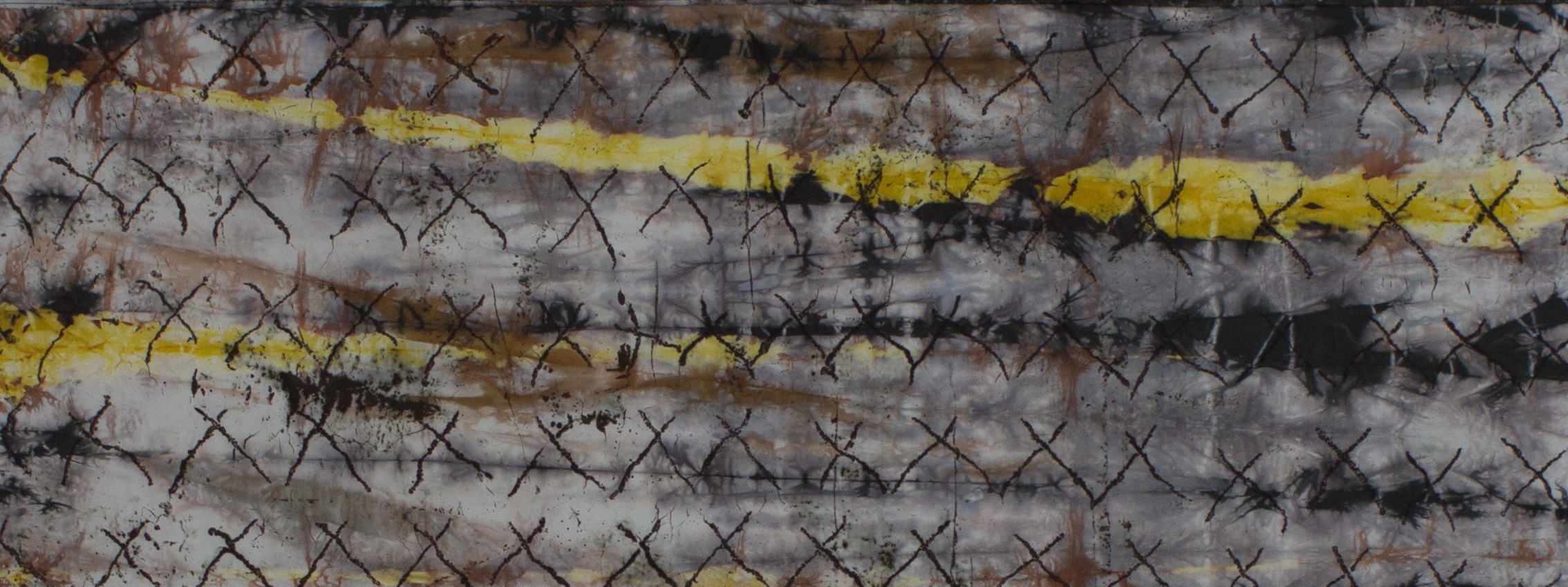
I like this piece. Again I have the same concern about how "done" it is. In this case I set my self the challenge to create the highest degree of complexity and layering that I could without washing the cloth. What I mean is that I printed and painted this cloth in about 8-10 sessions, but only washed it out at the very end. By contrast, the piece above was washed 3 times over the course of building up the surface design.
I tried to simplify but it didn't work
Today my parents came for a late lunch/early dinner. It was wonderful. Conveniently last nights dinner made a delicious encore for lunch. This was the first Christmas Day that Dan and I have spent in my own home in almost 20 years. When you don't have kids...well, I'm not even going to start on that.
Here are pics of some recent work. Some of which went in to gift packages right after a took the picture.
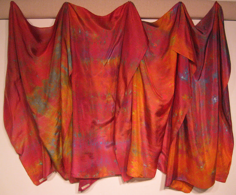
Four silk scarves from an especially good dyeing session. The colors are really amazing in person.
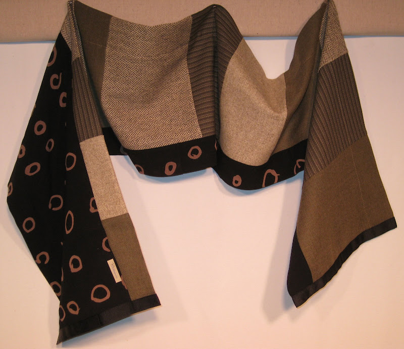
The picture below is a sample of some of the constructed scarves I've been making They've been very popular. This particular one combines commercial wool, and my discharged black rayon. It's basically a tube with a pieced front. The whole thing is assembled with a serger. The tube ends are squared up, sewn shut, then finished with grosgrain ribbon. I'm doing a similar type of scarf with polar fleece flatlocked together.
Finished commission work
I picked up a commission for some dyed and printed yardage a while back and was worried that I would never be able to fit it into my schedule. I'm happy to say that I did fit it in and am delighted with the results. Let's just hope the client shares my enthusiasm.
Both pieces are viscose rayon challis. I've sourced this cloth from Test Fabrics and Dharma and they are different. The Dharma cloth is the same that they use in their rayon garment blanks. It's got a nice hand and the sort of drape that you expect from rayon. The Test stuff seems a bit courser. Both are nice but the Dharma seems better suited to garments, which is the ultimate use for these commission pieces.
So, here's the first piece. I used a mixture of low water and full immersion, plus some direct dye application. The client requested deep purple with highlights of blue and other jewel tones. I think I hit the mark. I have to give credit here to the color mixing techniques that I learned from Carol Soderlund. I picked the purple I wanted and I got it. I have to admit that I'm going to be sorry to see this go away. I could make some cool stuff out of this.
The second piece is printed. The request was fantastic. It's what all artists dream of--something to the effect of, "I love your work and I love strong color...go for it." For this one I've got in-progress shots.
First, some energetic black lines and broad painterly marks to create a strong foundation and establish the beginning of a color palette.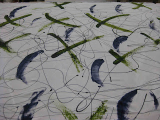
This cloth is going to become a shirt, so I had to rein in my desire for large-scale pattern. In the next shot you can see the 3rd, 4th, and 5th dye applications. the brown squares (ProChem Kahki) were screened with screen that I "damaged" earlier this year by leaving water soluable glue resist in it for too long. Now whenever I print with it I get these ghost patterns. It's one of the most productive mistakes I made in a while. The circles came next to expand the palette and pull the counter balance out the angles of the squares with some curves. The 5th layer was a screening of blue dots over the entire surface (seen in the background).
I might have been able to stop with that, but I was concerned about the strong contrast of the white background. A blue background was the perfect solution. The only problem is that I couldn't do that as a dye bath without altering many or all of the other colors already layed down. So...I spent a day hand painting the whole thing. It was the right thing to do, but very time consuming.
The washed version of the cloth is pretty much the same. Of course I had some dye loss, but generally got very good strike--gotta love that rayon.
Because these two pieces will be made into shirts, and because the dyerslist e-mails this week have been full of good reminders about the need for high-temperature washout for reactive dyes, AND because I didn't want to dye my client and his partner shades of purple--I soaked both of these pieces in 180 degree water. I was surprised by how much residual dye came out, but even after a final long wash cycle they both look bright and strong. I don't generally do REALLY hot washouts, but might need to reconsider that in the future.
